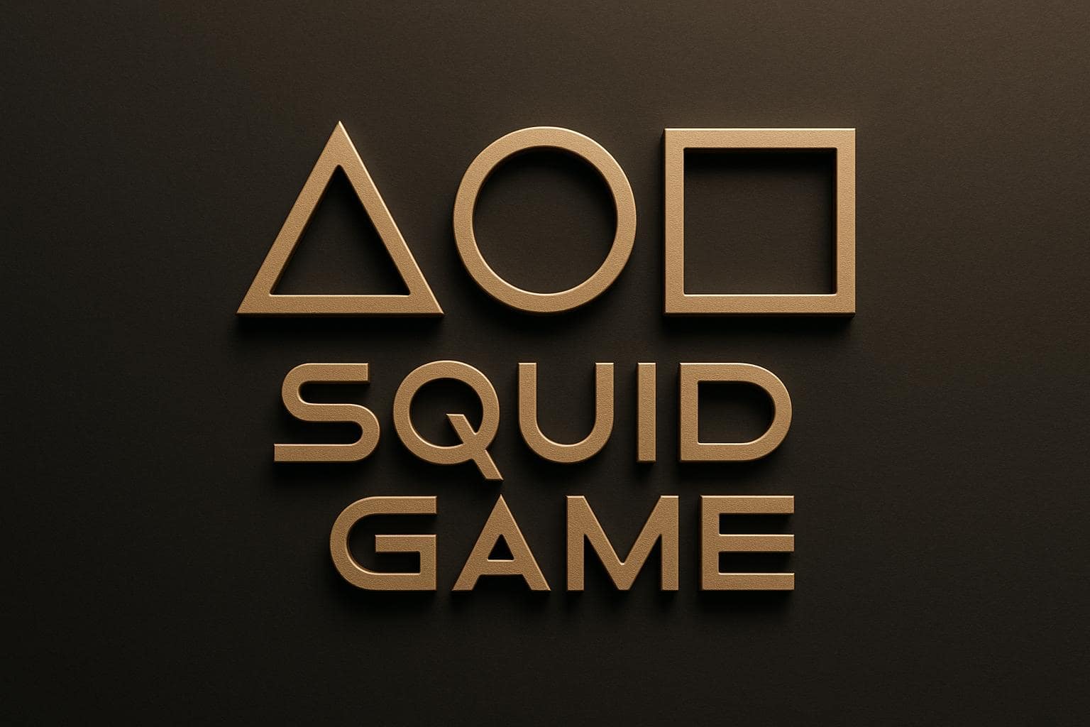
The Squid Game logo is more than just a design – it’s a visual representation of the show’s core themes: hierarchy, competition, and survival. The logo uses three simple geometric shapes – circle, triangle, and square – each symbolizing a specific role within the show’s strict power structure. These shapes also connect to the Korean title, "Ojingeo Geim", with the shapes forming the letters "O", "J", and "M" in Hangul.
Key Points:
- Circle: Represents workers, the lowest rank, symbolizing obedience and repetition.
- Triangle: Stands for guards, enforcers of rules and order.
- Square: Signifies managers, the highest authority within the visible hierarchy.
- The pink and green colors evoke nostalgia for Korean viewers, reflecting school supplies from the 1970s and 1980s.
- The shapes also reference the childhood game that inspired the series, bridging innocence with the show’s darker themes.
The logo’s simplicity and symbolism make it a storytelling tool, conveying complex ideas about power, survival, and identity through visual design.
The 3 Shapes and What They Mean
The geometric shapes featured in the Squid Game logo aren’t just for decoration – they play a crucial role in representing the strict hierarchy within the show’s universe. Each shape symbolizes a specific rank and set of responsibilities, reflecting the deeply structured power dynamics at play. Here’s a closer look at what each shape represents.
Circle: The Workers
The circle stands for the lowest-ranking members: the workers. These masked individuals handle the most basic yet grim tasks, such as disposing of dead bodies and performing general maintenance. They operate under a strict code of silence, only speaking when addressed by someone of higher rank. The circle, with its unbroken and continuous form, symbolizes their unwavering obedience and constancy in following orders.
Triangle: The Guards
The triangle represents the guards, who act as the enforcers of the rules. They patrol the facility, oversee the games, and maintain order. Armed and with more authority than the circle workers, these triangle-masked figures can issue commands to those below them in rank. The triangle’s sharp edges evoke a sense of balance and practicality, fitting for their role in keeping the system running smoothly.
Square: The Managers
The square signifies the managers, who are at the top of the visible hierarchy. These individuals oversee operations, make key decisions, and supervise the guards. With the most authority among the ranks, square-masked managers wield control over both the triangle guards and circle workers. The square’s four sides, representing stability and structure, reflect their role as the backbone of the system.
Shape Hierarchy Chart
| Shape | Role in Hierarchy | Key Responsibilities | Power Level |
|---|---|---|---|
| Circle | Workers (Lowest rank) | Dispose of bodies, perform maintenance, follow orders | No authority; silent unless spoken to |
| Triangle | Guards | Patrol, oversee games, enforce rules, carry weapons | Can command circle workers; obey squares |
| Square | Managers | Lead operations, supervise guards, make decisions | Highest authority; command all lower ranks |
The creators of Squid Game used these simple shapes to design a visually striking yet meaningful power structure. Interestingly, the number of sides in each shape correlates with the level of authority – more sides mean more power.
Korean Language and Game Connections
The geometric shapes in the Squid Game logo carry a deeper meaning, connecting both to the Korean language and traditional childhood games. These simple forms aren’t just visual elements – they hold linguistic and cultural significance that goes beyond their surface appearance.
Shapes That Form Korean Letters
The circle, triangle, and square in the logo each correspond to specific Hangul characters: ‘O,’ ‘J,’ and ‘M.’ Together, they form "OJM", the initials of Ojingeo Geim – the Korean name for Squid Game .
"The circle, triangle, and square represent the letter ‘O,’ ‘J,’ and ‘M,’ respectively, forming ‘OJM’ – these are also the initials of the squid game or Ojingeo Geim." – Pepper Square
This linguistic connection is subtly woven into the show’s design. In the opening sequence, the playing field transforms into the title card, with the shapes morphing from game elements into letters. This clever touch ties the visual identity of the show directly to the Korean language, adding a layer of meaning that resonates with its roots.
Links to Korean Childhood Games
These shapes also harken back to a traditional Korean children’s game that inspired the series. In this game, kids draw these geometric shapes on the ground to create a layout resembling a squid’s body . The squid-like figure that emerges from the shapes gives the game its name, which later served as the foundation for the show’s intense, life-or-death competition.
For Korean audiences, this connection stirs a sense of nostalgia, blending familiar childhood memories with the show’s gripping narrative. By using these shapes, the logo becomes more than just a visual marker – it taps into cultural identity and emotional memory, bridging the past with the present in a striking way.
Main Themes Shown in the Logo
The Squid Game logo is a striking representation of how rigid systems can strip individuals of their uniqueness, reducing them to mere components of a larger machine. Through its geometric design, the logo subtly conveys themes of structured roles and the erosion of individuality.
Competition and Survival
The logo’s shapes – a circle, triangle, and square – mirror the show’s brutal environment, where survival hinges on adhering to strict, impersonal systems. Its stark and minimalist design reflects a world where conformity is not just expected but necessary to endure. This visual simplicity reinforces the show’s exploration of survival under extreme conditions.
Social Hierarchy and Power
The geometric shapes also emphasize a rigid hierarchy, echoing the show’s portrayal of power dynamics. Each shape symbolizes a specific role, highlighting how individuals are defined not by their personalities or choices but by the functions assigned to them. This rigid structure mirrors the dehumanizing systems within the show’s universe.
Loss of Individuality
One of the most poignant aspects of the logo is how it reduces human complexity to basic symbols. By doing so, it reflects the show’s critique of systems that erase personal identity, replacing it with cold, functional categorization. This visual choice underscores the oppressive nature of such structures, where individuality is sacrificed for the sake of order and control.
The symbolism embedded in the Squid Game logo not only encapsulates the show’s narrative but also serves as a reminder of how design can convey profound social commentary. By integrating these themes, the logo becomes more than a visual marker – it transforms into a storytelling tool that resonates deeply with its audience.
sbb-itb-ba0a4be
Business Lessons: Logo Design and Brand Storytelling
The Squid Game logo demonstrates how simple shapes can convey deep and intricate brand stories. This concept mirrors the principles of effective business logo design. By focusing on intentional design, business owners can craft logos that communicate complex ideas in a visually straightforward way.
Simple Designs That Speak Volumes
The best logos often rely on basic shapes and minimal details to deliver their message. The Squid Game logo, with its three geometric shapes, shows that simplicity can be just as impactful as complexity. Why does this work? Simple designs are easier to remember and adapt seamlessly across various platforms and sizes.
When creating your logo, think about how to distill your brand’s core values into simple visual elements. For instance, a triangle could symbolize growth and stability, while a circle might represent unity and wholeness. Each shape should have a clear purpose, contributing to the story your brand wants to tell, without unnecessary clutter.
A clean and memorable design not only enhances recognition but also ensures your logo looks great whether it’s on a billboard or a business card.
Purposeful Design Choices
Simplicity is powerful, but only when every design choice is intentional. The Squid Game logo is a masterclass in this principle. From the selection of shapes to their arrangement, every element plays a deliberate role. Your logo should follow the same approach.
Ask yourself: Does your color palette reflect your brand’s personality? Do the shapes align with your industry and speak to your target audience? Each detail should support your brand’s identity and message.
Also, think about visual hierarchy. Just as the Squid Game logo emphasizes certain elements to guide the viewer’s attention, your logo should prioritize key components to ensure your message is clear at a glance.
The Power of Shapes and Symbols in Logos
Shapes carry meaning, and your logo can leverage this to strengthen your brand’s message. For example, squares can evoke feelings of reliability, while circles suggest harmony and inclusivity. The Squid Game logo uses primary geometric shapes that resonate universally, making it recognizable across different cultures. If you’re targeting a global audience, consider how symbols and shapes might be interpreted in various markets.
Color is another critical element. In the Squid Game logo, the stark color contrast reflects the show’s intense themes. Similarly, your business can use color strategically to evoke emotions or associations that align with your brand.
BusinessAnywhere: A Case Study in Visual Design
BusinessAnywhere showcases how thoughtful visual design can effectively communicate a broad range of services. Their branding emphasizes professionalism and accessibility, reflecting their mission to simplify complex tasks for entrepreneurs and digital nomads.
From Business Registration to Virtual Mailbox solutions starting at $20 per month, BusinessAnywhere maintains a consistent design language across all offerings. This unified approach builds trust and reinforces their identity as a reliable, all-in-one platform for managing remote businesses.
Even with diverse services, like Registered Agent Service and Online Notary Service, BusinessAnywhere’s cohesive visual identity makes it easy for customers to navigate their options while feeling confident in the brand’s expertise. This is a prime example of how effective design can bridge complexity and simplicity, creating a seamless experience for users.
Conclusion: Why Symbols Matter in Design
Drawing from the symbolism and deeper meanings we’ve explored, the Squid Game logo proves that even the simplest designs can carry profound messages. With just three geometric shapes, it became one of the most recognizable logos in modern entertainment. This design communicates intricate ideas about hierarchy, power, and human nature – without a single word.
Key Points for Business Owners
When crafting your business logo, think beyond aesthetics and focus on symbolism that aligns with your brand’s identity. For example:
- Circles suggest unity and inclusivity.
- Triangles imply direction and progress.
- Squares represent stability and trust.
Color contrast is another critical factor. It ensures your logo stands out and remains clear across various formats, whether it’s on a business card or a massive billboard.
Equally important is considering your target audience’s cultural background. Universal shapes, like circles and triangles, often resonate across different markets, making them ideal for global businesses such as e-commerce platforms or remote service providers.
Lastly, hierarchy in design plays a key role. Your logo should guide the viewer’s attention to the most vital element first – whether that’s your brand name, a distinctive symbol, or a unique feature that differentiates you from competitors. The right design choices can create a logo that not only stands out but also builds a strong and lasting brand identity.
The Squid Game Logo’s Lasting Impact
The Squid Game logo is a masterclass in simplicity and adaptability. It sparked global conversations about power and inequality, transcending its role as a television series emblem to become a symbol recognized worldwide. Its clean, straightforward design allowed it to transition seamlessly across platforms and cultures.
For business owners, this serves as a reminder of the value of investing in thoughtful logo design. A well-designed logo isn’t just a visual marker for your brand – it can become a conversation starter, a memory trigger, and a representation of your core values and quality.
The enduring success of the Squid Game logo highlights an essential truth: in a world filled with complexity, intentional design rooted in cultural awareness and symbolic meaning creates the deepest connections. While your logo might not achieve instant global fame, applying these principles can help your brand make a meaningful and lasting impression in your market.
FAQs
What do the shapes in the Squid Game logo represent, and how do they reflect the show’s themes?
The shapes in the Squid Game logo – circle, triangle, and square – aren’t just random designs; they each signify a distinct role within the show’s hierarchy. The circle stands for the workers who carry out orders, the triangle represents the armed guards responsible for enforcing rules, and the square signifies the managers who oversee the entire operation. These shapes come together to visually represent the rigid power dynamics and societal structure at the heart of the show’s story.
This clever use of simple geometric shapes does more than just create a striking visual – it underscores the themes of control, survival, and oppression. The logo uses minimalism to convey the complexity of authority and humanity’s relentless struggle for power.
What do the colors and shapes in the Squid Game logo represent in Korean culture?
The colors and shapes in the Squid Game logo are steeped in meaning tied to Korean culture. The pink and green tones are more than just striking visuals – they reflect ideas of authority and control. Pink, in particular, is often linked to power structures and order. Meanwhile, the geometric shapes – circle, triangle, and square – aren’t random; they draw inspiration from the Korean alphabet and traditional design, symbolizing roles within society, such as workers and supervisors.
The use of red and blue also nods to the Korean flag, symbolizing the balance of opposites like life and death. Together, these design choices reinforce the show’s focus on competition, survival, and the harsh realities of societal inequality, while staying deeply connected to cultural roots.
What does the Squid Game logo symbolize about individuality and society?
The Squid Game logo uses basic geometric shapes – circle, triangle, and square – to represent the erasure of individuality. These shapes, paired with the masks worn by characters, strip away personal identity, reducing people to mere roles within a strict system. This visual design underscores themes of conformity and control, highlighting how societal structures can dehumanize and enforce hierarchy. It perfectly aligns with the show’s focus on survival, competition, and the suppression of uniqueness to maintain order.