The Twitter logo has evolved significantly over the years, reflecting the platform’s changing identity and goals. Initially, it started with a simple text-based design in 2005, followed by the introduction of "Larry the Bird" in 2010, symbolizing communication and freedom. In 2012, the bird became the sole logo, designed with 15 circles to represent balance and progress. However, in 2023, Elon Musk replaced the iconic bird with an abstract "X", signaling a shift in Twitter’s broader vision.
Key points about the Twitter logo:
- 2005: Text-based "twttr" design.
- 2010-2012: Introduction of the blue bird (Larry), symbolizing speed and connection.
- 2012: Transition to a bird-only logo, designed with geometric precision.
- 2023: Rebranding to the "X" logo under new leadership, representing modernity and change.
Each change reflects Twitter’s growth, branding strategy, and evolving role in global communication.
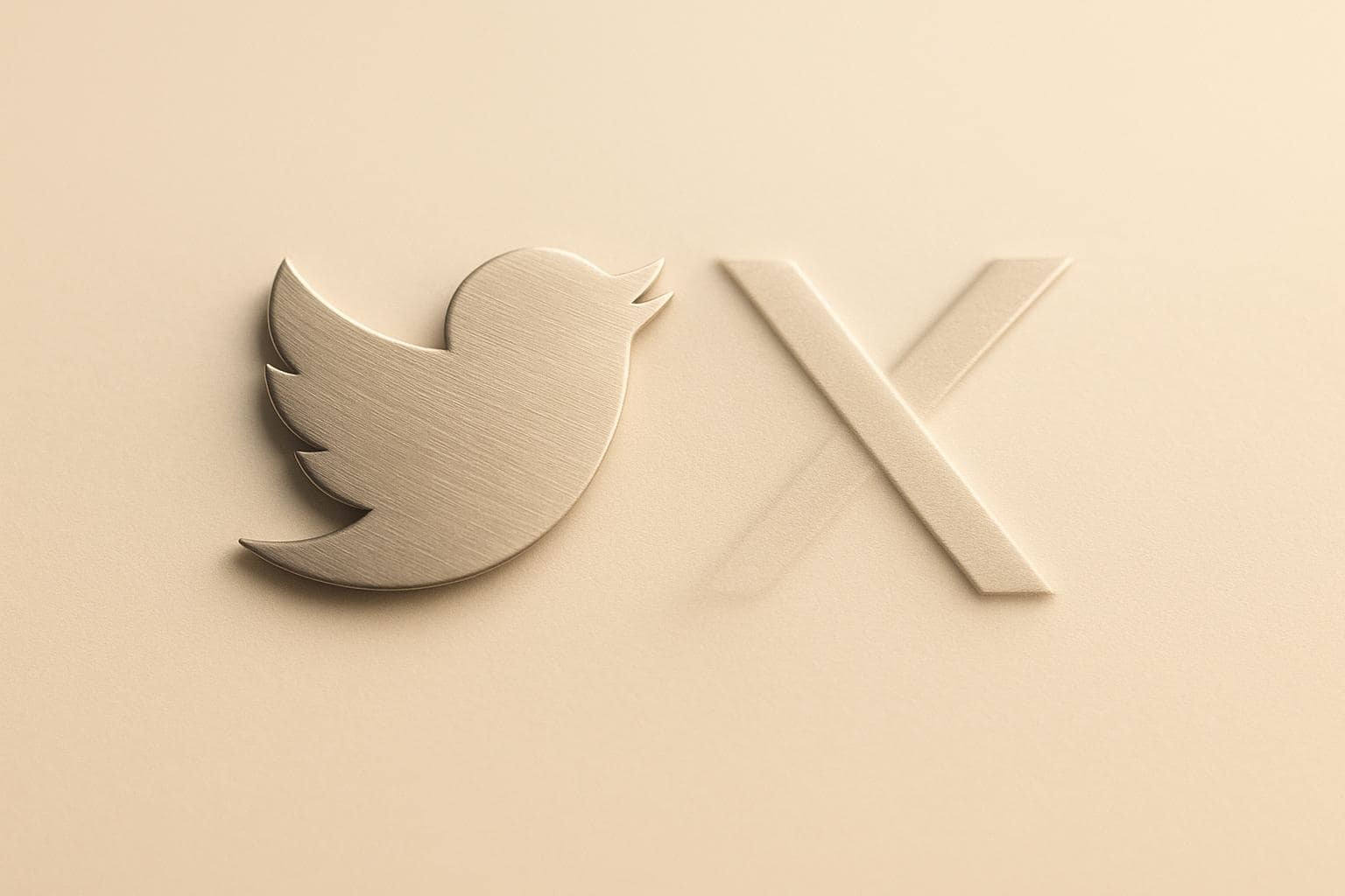
Twitter Logo History and Changes
The evolution of Twitter’s logo reflects the platform’s journey and the shifts in its brand identity over time. Each redesign highlights how visual elements can redefine a brand’s image and adapt to changing market dynamics.
Early Designs: Text Logos and Larry the Bird

Twitter’s story began in 2005 with its first logo, featuring the name "twttr" in simple green text. Designed by co-founder Biz Stone, this minimalist, text-only logo mirrored the platform’s experimental beginnings and its focus on SMS-based messaging. By 2006, the platform transitioned to a blue wordmark with a clean, rounded sans-serif font. The blue color choice symbolized trust and stability, while the refined design reflected a move toward professionalism.
From 2010 to 2012, Twitter introduced the now-famous blue bird icon, affectionately referred to as "Larry the Bird", alongside the wordmark. The bird symbolized the freedom and speed of communication, aligning perfectly with Twitter’s core purpose. This addition set the stage for the bird to eventually take center stage as the sole representation of the brand.
2012: Switch to Bird-Only Logo
In 2012, Twitter made a bold move by dropping the text entirely and focusing solely on the bird icon. This new design was crafted using 15 circles based on the golden ratio, creating a balanced and visually pleasing symbol. The upward-facing bird conveyed optimism and progress, becoming an instantly recognizable emblem worldwide. This change solidified Twitter’s identity as a global platform for communication and connection.
2023: Change to the "X" Logo
In 2023, under Elon Musk’s leadership, Twitter underwent its most dramatic visual transformation yet. The iconic bird was replaced with an abstract "X" symbol, representing a complete break from its traditional imagery. This redesign marked a new chapter for the platform, suggesting a broader shift in its services and ambitions.
Each phase of Twitter’s logo evolution tells a story of strategic design choices, reflecting the platform’s growth, market positioning, and readiness to embrace change. These transformations highlight the power of visual branding in shaping public perception and global identity.
Logo Design Elements and Their Meaning
Twitter’s logo design reflects its core principles: communication, connection, and simplicity. Every element of the logo contributes to its identity, blending a sense of tradition with forward-thinking ideas.
What the Bird Represents
The iconic bird embodies open communication and connection, capturing the essence of freedom and outreach. Its upward angle conveys a sense of progress and ambition, aligning perfectly with Twitter’s role in fostering global conversations.
Why Twitter Used Blue
Color is just as important as shape in design, and Twitter’s choice of blue isn’t random. Blue is often associated with trust, clarity, and approachability – qualities that underscore Twitter’s dedication to creating a secure and inclusive space for dialogue.
What the ‘X’ Symbol Means
The introduction of the ‘X’ marks a new chapter for the platform. It represents a move toward modernity and technological sophistication with its clean, minimalist look. This design choice signals Twitter’s evolution, aiming to transcend the boundaries of traditional social media.
How the Logo Shapes Brand Identity
A logo is the cornerstone of how a brand is perceived. Taking inspiration from Twitter’s design evolution, its logo has consistently played a key role in defining the platform’s identity. These visual elements not only embody Twitter’s core principles but also influence how users emotionally connect with the brand.
How the Logo Reflects Twitter’s Values
Twitter’s original bird logo was more than just a simple design – it symbolized clarity and effortless communication. Its clean and straightforward aesthetic made it instantly recognizable to a global audience. The upward tilt of the bird conveyed a sense of progress and worldwide connectivity. In contrast, the transition to the ‘X’ logo marked a departure, embracing a more abstract and tech-oriented look, signaling a shift in brand direction.
How Logo Changes Impacted Public Perception
When a logo changes, it often triggers a shift in how the brand is perceived. Twitter’s move from the iconic bird to the ‘X’ logo stirred strong reactions. While some users appreciated the fresh take, others, especially longtime users, felt a sense of loss for the bird that had become a symbol of the platform’s identity. These reactions serve as a reminder of how deeply people connect with familiar branding elements and how those changes can influence public sentiment.
Branding Lessons for Business Owners
Twitter’s journey offers valuable takeaways for entrepreneurs aiming to craft or refine their brand identity:
- Keep visual elements consistent to establish and maintain trust.
- Retain key aspects of your previous logo during updates to make transitions smoother.
- Use thoughtful design updates to signal growth while preserving brand familiarity.
- Ensure your logo is versatile enough to work across different formats, from app icons to large displays.
- Understand that logos often carry emotional weight for customers, so changes can provoke strong reactions.
These lessons highlight the importance of intentional and well-planned design decisions in building a brand identity that resonates with your audience.
sbb-itb-ba0a4be
The Twitter Logo’s Lasting Impact
Twitter’s visual evolution is a testament to how design can shape perception and leave a lasting mark. The changes to its logo show that even a simple symbol can reflect core values and create strong emotional connections with users.
From its early text-based logo to the instantly recognizable bird icon, Twitter’s journey highlights the power of strategic visual changes to reinforce a brand’s identity and message.
Key Lessons for Entrepreneurs
Twitter’s logo evolution offers valuable insights for business owners developing their own brand identities. A well-thought-out logo has the ability to convey complex ideas – like movement, freedom, and connection – through simple yet effective visual elements. Additionally, the emotional bond that users form with a familiar logo emphasizes the importance of maintaining consistency in branding.
Simplicity stands out as a crucial factor, especially in digital spaces. Whether appearing as a tiny app icon or on a massive billboard, a logo must scale seamlessly across different platforms while staying recognizable. These principles remain relevant as businesses navigate the challenges of modern digital branding.
The Logo’s Ongoing Influence
Twitter’s logo continues to shape trends in digital branding. Many companies now favor abstract and streamlined designs to meet the preferences of contemporary audiences.
Ultimately, Twitter’s story demonstrates that a logo is far more than just a graphic. It serves as a bridge between a company’s values and how it is perceived by the public. For entrepreneurs aiming to build a brand that resonates and endures, Twitter’s experience offers plenty of inspiration and practical lessons.
FAQs
Why did Elon Musk change the Twitter bird logo to an ‘X’?
Musk changed Twitter to X as part of his vision to create a comprehensive "everything-app" offering services from online banking to video messaging, beyond just social media. The rebrand also reflects his personal affinity for the letter X dating back to PayPal days, and serves as a way to put his own stamp on the $44 billion acquisition. However, the change reportedly wiped $4 billion off the brand’s worth by abandoning Twitter’s iconic recognition.
Elon Musk’s Bold Move: Twitter’s Bird Logo Becomes ‘X’
Elon Musk has swapped out Twitter’s well-known bird logo for a sleek, abstract ‘X.’ This new symbol signals a major shift, representing a broader vision for the platform – one that aims to push past its original identity and explore fresh opportunities.
The change highlights Musk’s commitment to reshaping Twitter’s purpose. While staying true to its roots of connection and communication, the platform is embracing a more forward-thinking and energetic approach.
What does the Twitter logo symbolize, and how has it evolved over time?
The Twitter bird symbolized joy, freedom, and hope, representing the concept of "tweeting" like a bird. The blue color symbolized trust, stability, and communication to foster open sharing among users. The logo evolved from simple text-based designs to a stylized bird inspired by a hummingbird in flight, eventually becoming just the iconic blue bird. In 2023, it was replaced with a stark black "X" representing multiplication, expansion, and entry into new territories as part of the platform’s rebrand.
The Evolution of the Twitter Logo
The Twitter logo has seen several transformations over the years, each reflecting the platform’s changing mission and identity. The original bird design was more than just a logo – it represented openness, communication, and the free exchange of ideas. This perfectly aligned with Twitter’s early goal of enabling global conversations.
As the platform grew, the logo evolved too. It became sleeker and simpler, embodying a modern and clean aesthetic. This shift toward minimalism mirrored the platform’s desire to stay relevant in a fast-changing digital landscape.
The latest change, introducing the ‘X’ logo, signals a bold new direction. It highlights Twitter’s focus on versatility, innovation, and creating broader connections. Even with these updates, the essence of Twitter – freedom and creativity – remains at its core. This evolution shows how a brand’s visual identity can adapt over time while staying true to its foundational values.
How does updating a logo impact a brand’s image and customer engagement?
Updating a logo can completely reshape how a brand is seen and how customers connect with it. A well-planned redesign can signal progress, a modern approach, and a commitment to meeting the changing needs of customers. This can build trust, improve brand recognition, and even re-ignite interest among your audience.
On the flip side, if the update strays too far from the brand’s core identity or feels out of sync, it might create confusion or risk alienating loyal customers. When approached with care and strategy, a logo refresh becomes a powerful way to revitalize a brand’s image and deepen its bond with customers.