Creating a pitch deck that grabs investors’ attention boils down to three essentials: clarity, data, and design. Investors review thousands of decks annually, spending just a few minutes on each. Your goal? Make your message clear, your vision engaging, and your slides visually appealing. Here’s how:
- Focus on the Problem and Solution: Clearly define the problem your business solves and show how your product or service addresses it better than existing options.
- Market and Financials Matter: Use credible data to highlight market size, growth potential, and your revenue model. Include realistic financial projections tied to specific goals.
- Design for Impact: Keep slides simple – one idea per slide with concise text and visuals. Use high-contrast colors, readable fonts, and clean layouts to make a strong impression.
Essential Components of a Winning Pitch Deck for Investors
Core Components Every Pitch Deck Needs
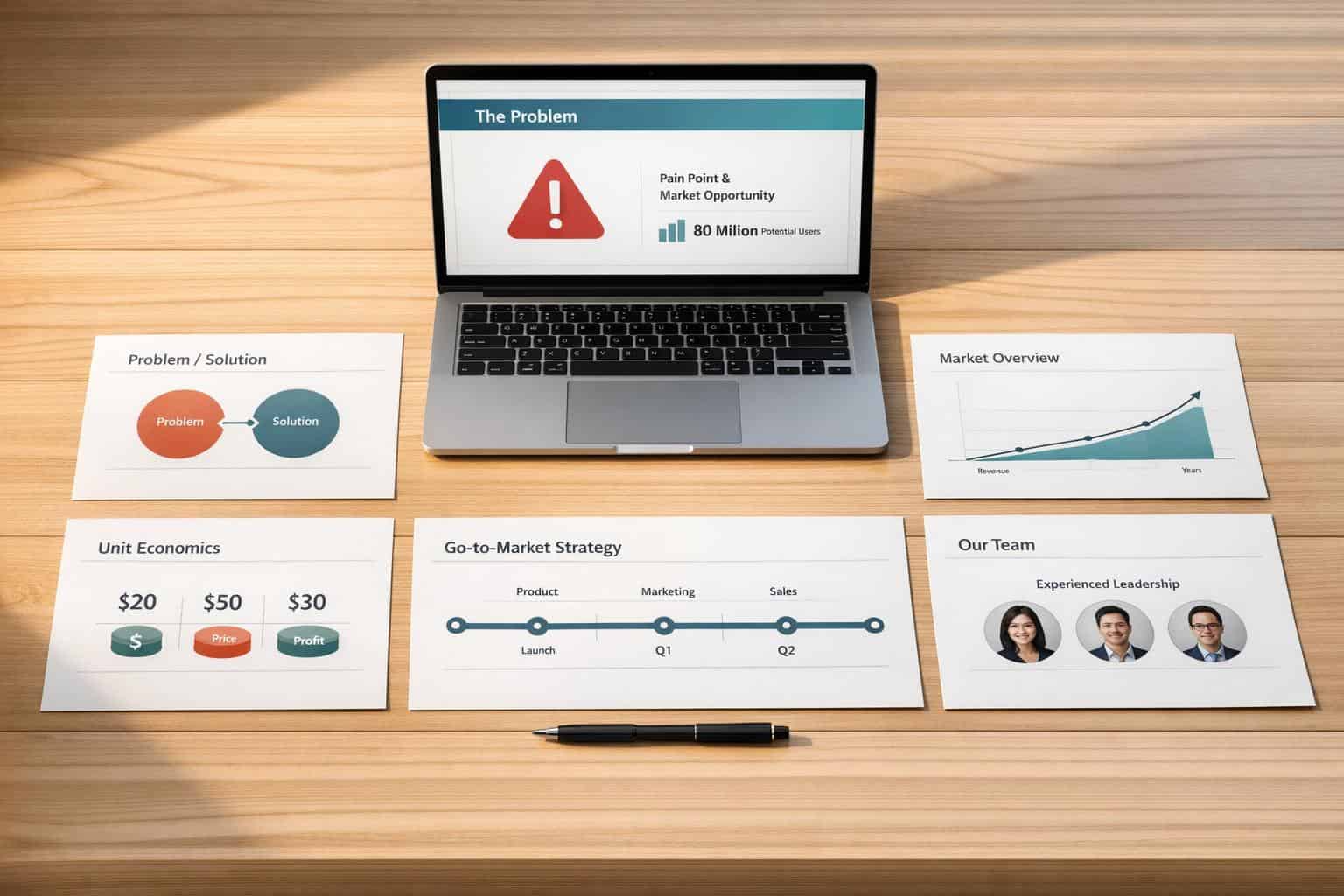
When crafting a pitch deck, it’s essential to include every key element that helps build a compelling case. From identifying the problem you’re tackling to clearly stating your funding requirements, each slide should flow logically into the next, leaving no gaps in your narrative.
Define the Problem
Start by outlining the problem your business addresses, backed by solid data. Highlight its impact and the shortcomings of current solutions. Be specific about who is affected – this not only defines your target market but also shows you understand your customer base.
For instance, if you’re offering a remote collaboration tool, don’t just say, "remote work is challenging." Use stats or insights to show how inefficiencies in remote work affect productivity and why existing tools fail to solve these issues.
Present Your Solution
Next, showcase your product or service. Use visuals like mockups or demo screenshots to bring your solution to life. Focus on how your offering solves the problem better than existing options. If you’ve developed a prototype, include it to demonstrate progress beyond the concept phase.
Keep this section straightforward – explain what your product does and how it works. Save highly technical details for an appendix. Use visuals to highlight functionality, while reserving charts for financial data.
Market Size and Growth Potential
Investors need a clear understanding of your market. Break it down using the TAM/SAM/SOM framework. Rely on credible sources like government data, academic studies, or industry reports, and make sure to properly cite them.
"We love when a founder has an exceptional grasp of the market they’re building. Competition is always present, so opinionated founders who are deeply embedded in the problem give us confidence in a partnership." – Kate McGinn, Analyst
Show the market’s growth trajectory and highlight current spending trends in similar sectors. Use clear, concise charts to make large figures easy to digest, and avoid overly broad market definitions – this reassures investors that your projections are grounded.
Revenue Model and Pricing
Explain how your business plans to make money. Whether it’s a subscription model, transaction fees, or freemium offerings, detail your revenue streams, pricing strategy, and unit economics. This shows you’ve thought through how to scale effectively.
If you’re not generating revenue yet, outline your pricing plans based on market research or customer feedback. Highlight your understanding of key metrics like customer acquisition cost (CAC) and lifetime value (LTV).
Financial Forecasts and Funding Request
The financial section is often the most scrutinized part of a pitch deck. Provide a 3-year forecast that includes an income statement, balance sheet, and cash flow statement. Use engaging charts to present the data, and always format currency in USD (e.g., $1,500,000 or $1.5M).
"A pitch deck is not a silly hoop that VCs make you jump through. It’s a tool that lets an entrepreneur control how they tell the story." – Benedict Evans, Venture Capitalist
Link your funding request to specific milestones, such as entering new markets or expanding your team. Support your projections with historical data where possible, and be ready to explain the assumptions behind your growth estimates.
sbb-itb-ba0a4be
How to Design Professional Slides
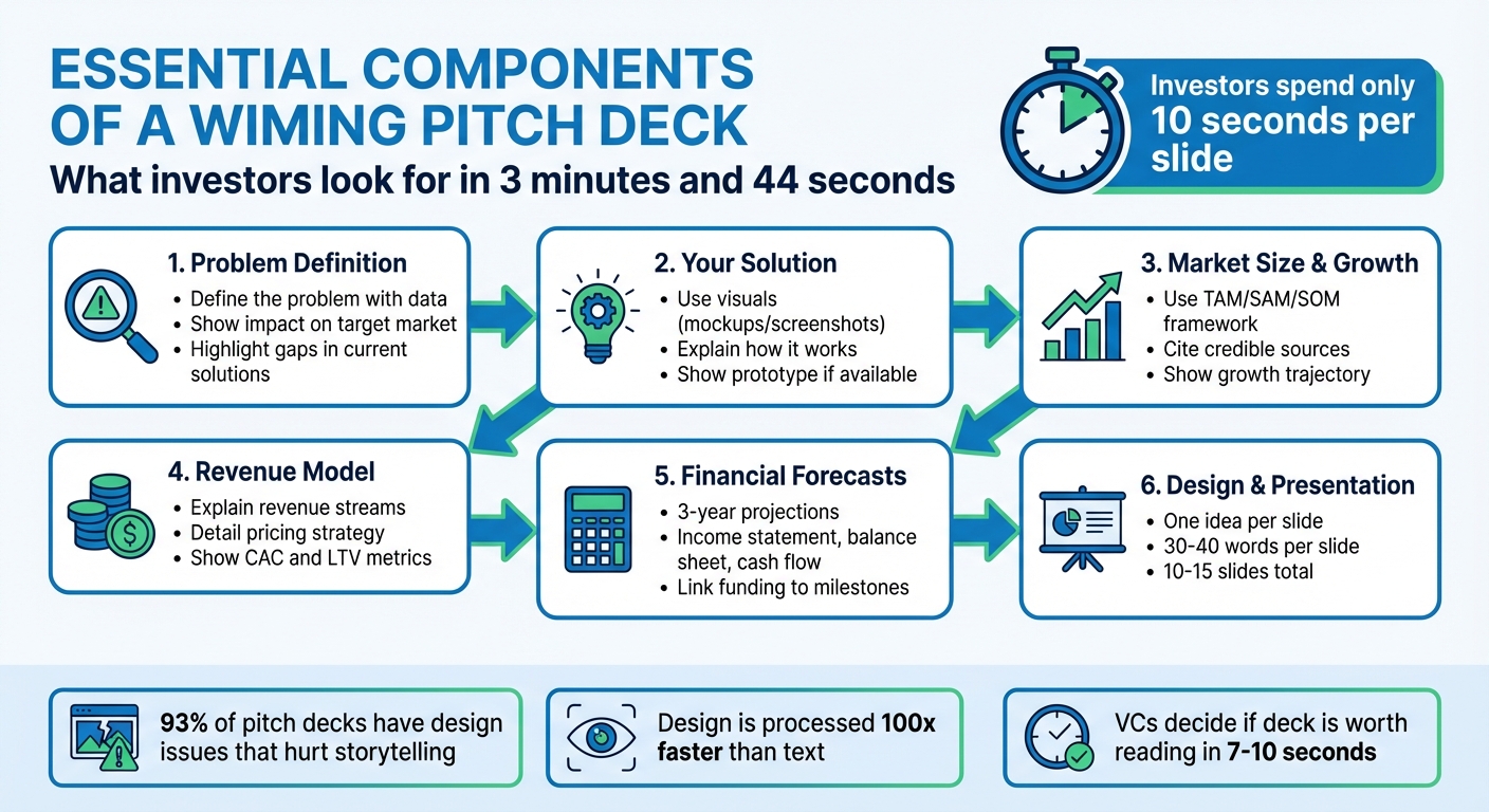
The way your slides look says a lot about your professionalism. Investors form their first impression of your clarity and preparedness within just 7–10 seconds. Since design is processed 100 times faster than text, a poorly designed slide can ruin your chances before anyone even reads a word.
Here’s the reality: investors spend an average of only 3 minutes and 44 seconds reviewing an entire pitch deck. That’s about 10 seconds per slide. A 2023 study found that 93% of pitch decks had design issues that hurt the founder’s ability to tell their story effectively. Your slides need to communicate instantly and effortlessly.
"A VC decides whether your deck is ‘worth reading’ within the first 7–10 seconds – purely based on design signaling." – Funding Blueprint
Key Slide Design Principles
Stick to the "one slide, one idea" rule. Each slide should focus on a single concept that can be understood in under 3 seconds. Structure your slides with four essential layers:
- Headline: Clearly state your main point.
- Supporting Evidence: Include data or metrics to back up your point.
- Visual Anchor: Use a chart, image, or graphic to make the slide visually compelling.
- Details: Add any necessary context.
Keep your text concise – 30 to 40 words per slide is ideal. Follow the 5x5x5 rule: no more than 5 lines of text, 5 words per line, and avoid having more than 5 text-heavy slides in a row.
Make good use of whitespace. Limit your content to 30–40% of the slide area to create a clean, premium look. For readability, use high-contrast color schemes, and stick to two fonts at most. Sans-serif fonts like Inter, Helvetica Neue, or Montserrat work well. For digital presentations, set your body text at 14–18pt, and ensure no text element is smaller than 24pt.
Recommended Design Tools
To simplify the design process, consider these tools:
- Canva: Great for beginners, with free templates for pitch decks. The Pro version offers advanced branding and customization features.
- Beautiful.ai: Uses AI to automatically optimize layouts and keep your slides visually consistent.
- Visme: Provides free templates and interactive design options tailored for startups.
- Flipsnack: Ideal for creating interactive, digital-first decks with embedded videos or clickable elements.
Slide Structure Tips
Once you’ve chosen your tools, follow proven design strategies to make your slides stand out.
Start with the 10-foot test: step back 10 feet from your screen. If the main message isn’t clear within 3–5 seconds, simplify your design. Arrange content to match how the eye scans under pressure: place headlines in the top-left, key metrics in the top-right, and stack supporting details vertically along the left side.
Use the 60/30/10 rule to balance visual elements: 60% of the slide should focus on your headline and key proof, 30% on visuals, and 10% on supporting notes. Maintain a consistent grid system with uniform margins and heading placements across all slides. This consistency helps your business appear polished and credible.
For typography, ensure line height is 120%–140% of the font size for optimal readability. When showing data, use charts instead of dense tables, and make sure every visual has a clear takeaway. Even color choices matter: blue suggests trust and reliability, while green represents growth. Keep your pitch deck concise – 10 to 15 slides is the sweet spot for holding investor attention.
Up next, we’ll look at common mistakes that can derail your pitch deck and how to avoid them.
Mistakes to Avoid in Your Pitch Deck
Once your slide design is polished, it’s just as important to steer clear of common mistakes that could derail investor interest. Even the most promising business ideas can falter if their pitch decks contain glaring errors. Venture capitalists, who sift through thousands of decks annually, are quick to spot signs of inexperience or poor preparation. Knowing these pitfalls – and how to sidestep them – can make all the difference in securing funding.
Too Much Information Per Slide
Packing slides with excessive details can dilute your message. Considering that most investors spend less than 4 minutes reviewing a pitch deck, your slides must deliver your points clearly and quickly.
Each slide should focus on a single, concise idea. Aim for 3 to 5 bullet points per slide to keep things readable. If your slide’s message isn’t clear within 10 seconds, it’s time to simplify. Jesse Heikkilä, a VC at Failup Ventures, emphasizes:
"If I don’t know what your company does by Slide 3, I’m out".
A great example comes from Coplay.dev‘s pitch deck, which caught the attention of VCs during a HubSpot for Startups event. Most of their slides had fewer than 10 words, making them visually clean and easy to grasp. For in-depth details like financial models or technical specifics, use an appendix. This way, you can provide extra information during your presentation without cluttering your main slides.
Failing to Address Competition
Claiming your business has "no competition" is a major misstep. Richard D. Harroch, Managing Director at VantagePoint Capital Partners, cautions:
"Telling investors that you have no competition will likely result in the investors believing you are unrealistic or naive".
Investors can – and will – research competitors with ease, so excluding this information may make you seem uninformed about your market.
Even if no direct competitor exists, identify indirect competitors or current alternatives your target customers rely on. Use your competition slide to emphasize how your product, technology, or strategy stands out. Show why your solution is hard to replicate and how it fills a gap in the market.
Inflated Financial Numbers
Overblown financial projections are a quick way to lose investor trust. For example, claiming you’ll generate $500M in revenue within three years – starting from zero – without solid backing will raise red flags. Investors value realistic, data-driven projections grounded in your current performance and market research.
Stick to projections spanning 3 to 5 years and base them on straightforward calculations, like "Number of customers × Price". Use industry benchmarks and your actual growth trends to guide your estimates. If your numbers seem too good to be true, investors will assume they are – and you risk losing credibility.
Tailoring Your Pitch for US Investors
When presenting to US investors, it’s not just about having a polished pitch deck. You need to show a deep understanding of their market, demonstrate the ability to navigate US regulations, and outline a realistic plan for scaling within the country. If your business operates remotely or virtually, you’ll also need to prove that your model can thrive without physical limitations while meeting compliance standards in the US.
Show How Your Business Scales Remotely
US investors are increasingly drawn to businesses that can grow without being tied to a physical location. But it’s not enough to say your virtual model works – you need to show it’s a strategic advantage. Take MURAL, for example. In 2011, co-founders Mariano Suarez-Battan, Patricio Jutard, and Agustin Soler raised $23 million in Series A funding by positioning their digital collaboration platform as essential for remote teams. Their pitch deck clearly demonstrated how their solution addressed real challenges in a changing work environment.
Your pitch should also include a "Why Now" slide to explain why the timing is perfect for your business. Crossbeam co-founders Robert Moore and Buck Ryan successfully used this tactic in 2018, securing $12.5 million in Series A funding from Salesforce Ventures and HubSpot Ventures. Their pitch highlighted how growing enterprise SaaS adoption and APIs created the ideal conditions for their collaborative data platform. Use this approach to pinpoint the technological shifts, policy updates, or market trends that make your remote business poised for growth right now.
To further solidify your case, present measurable digital KPIs. Metrics like user growth, retention rates, and revenue trends help prove traction. Go beyond vague revenue projections – get specific. Break down how many US customers fit your target profile, what you’ll charge per customer, and how you plan to capture them.
Once you’ve shown your business can scale remotely, back it up with a strong legal and operational foundation.
Address Legal and Compliance Requirements
A solid growth strategy isn’t enough – you also need to show that your business is legally sound and ready to operate in the US. This is especially important for remote businesses, as US investors will want to know how you’re handling state-specific requirements like LLC formation, registered agents, and maintaining a professional US address. Secureframe co-founders Shrav Mehta and Natasja Nielsen nailed this aspect in 2020 when they raised $56 million in Series B funding. Their pitch highlighted their operational scale, which included over 80 employees and 100+ integrations, demonstrating a compliant and professional infrastructure.
Be transparent about your legal foundation. Mention how you’re using services for LLC formation, registered agents, or virtual mailboxes to stay compliant across different states. US investors want to see that you’ve thought through the logistics of running a business remotely while adhering to local regulations. Address potential challenges like data privacy laws, industry-specific rules, or state filing requirements directly.
Include US Market Data
Backing up your pitch with US-specific market data can make a big difference. Investors expect precise stats from reliable sources like the Bureau of Labor Statistics, academic studies, or industry reports. Your market analysis should focus on the portion of the US market you can realistically capture, using hard data to prove your potential.
Competitive analysis is another must. Identify your direct, indirect, and legacy competitors in the US market. As LinkedIn co-founder Reid Hoffman puts it:
"Being detailed about your competition, especially listing the specific companies, helps increase investor confidence".
A four-quadrant matrix can help you visually position your business against competitors, highlighting your strengths – whether it’s your technology, pricing, or an innovative business model.
Finally, include a US-specific roadmap in your pitch. Outline key milestones like customer acquisition goals in specific regions, plans to secure US certifications, or partnerships with US-based companies. This shows investors that you’re not just thinking globally – you’re ready to execute a concrete strategy for the US market.
Conclusion
Crafting a pitch deck that grabs investors’ attention boils down to weaving a strong story, backing it with reliable data, and presenting it with polished design. Keep it concise – ideally 10 to 15 slides – since investors typically spend just 2 to 3 minutes on each slide. Every slide should serve a purpose, whether it’s advancing your story, highlighting key metrics, or visually showcasing your solution.
Start by identifying the problem and demonstrating how your solution addresses it. Back your claims with clear, measurable data, such as revenue growth, customer acquisition costs, or user engagement. As Mahnoor Sheikh, Content Strategist at Visme, explains:
"A winning pitch deck is short, sharp and impossible to ignore. It gives investors exactly what they need – nothing more, nothing less".
Visuals play a major role in your pitch. Each slide should focus on a single key idea, using minimal text and impactful visuals – think product screenshots, charts, or logos of recognizable customers – to establish credibility instantly. Create two versions of your deck: a streamlined one for live presentations and a more detailed version with commentary for investors to review later.
FAQs
What’s the ideal slide order for a pitch deck?
The best way to structure a pitch deck is to follow an order that tells a clear story while addressing what investors want to see. A common setup includes these slides:
- Title Slide: Introduce your startup with its name and tagline.
- Problem: Outline the issue your target audience faces.
- Solution: Present how your product or service solves the problem.
- Market Opportunity: Highlight the size and potential of your target market.
- Product/Service: Showcase what you’re offering and how it works.
- Business Model: Explain how your startup makes money.
- Traction: Share any progress or milestones achieved so far.
- Financials: Provide a snapshot of your financial performance and projections.
- Funding Ask: Specify how much funding you’re seeking and how you’ll use it.
- Team: Introduce the key players behind the company.
- Closing/Call to Action: End with a strong message or next steps.
This layout keeps things organized, builds trust, and ensures you hit the critical points investors care about.
What traction metrics matter most to investors?
When pitching to investors, certain metrics carry the most weight. These include market validation, which shows that your product or service addresses a real need, and customer growth, which reflects how well you’re attracting and retaining users. Investors also pay close attention to revenue or sales figures, as they highlight your ability to generate income, and user engagement, which indicates how actively your customers interact with your offering.
Additionally, other key performance indicators (KPIs) that demonstrate measurable progress and scalability can make a strong impression. The goal is to provide data that clearly shows your business has the potential to grow and thrive.
What should I include in the deck versus the appendix?
Your pitch deck should highlight the essentials: your company’s mission, the problem you’re solving, your solution, market opportunity, team, and financial projections. These key elements are what grab investors’ attention and clearly communicate your value.
For more detailed or supporting information – like in-depth market analysis, financial models, technical data, or legal documents – use the appendix. This approach keeps your main deck focused and concise, while still providing the additional details investors might ask for.