

Mascot logos can make a brand easier to remember – but they are not a good fit for every business. From KFC and Planters to GEICO and M&M’s, the pattern is simple: mascot logos work best when the character is easy to spot, fits the market, and still reads well at small sizes.
If I had to sum up the full article in a few lines, I’d put it like this:
- Mascots help with personality and recall
- They often cost more to build and maintain
- Small-size use is a common problem
- Food, snacks, and family brands tend to get the most from them
- Law, finance, and many B2B brands usually should not use them as the main logo
The six examples in this piece show different ways mascot logos can work:
- KFC uses a founder face tied to brand history
- Mr. Peanut turns the product into the brand character
- Aflac Duck fixes a name-awareness problem
- GEICO Gecko makes a dry category feel more human
- M&M’s characters use a group instead of one face
- Pringles shows how one simple feature can carry a logo
A few stats from the article make the case clear:
- Aflac brand recognition went from about 11% to 71%, then later near 90%
- GEICO’s Gecko hit 94% recognition in one survey
- Planters saw online chatter jump 2,000% during its 2020 campaign
- Research cited in the article says campaigns with a brand character are 37% more likely to grow market share
Quick Comparison
| Brand | Main strength | Main weakness | Best takeaway |
|---|---|---|---|
| KFC | Strong history and founder link | Full portrait can be hard at tiny sizes | A real person can anchor a food brand |
| Planters | Product and mascot are tightly linked | Harder to stretch past peanuts | Literal mascots can work well |
| Aflac | Helped people remember the brand name | Playful tone can be risky in insurance | A mascot can fix an awareness issue |
| GEICO | Friendly face in a dry market | Character works better in some channels than others | Simple characters travel well |
| M&M’s | Many personalities for many campaigns | More characters mean more upkeep | A cast gives more story options |
| Pringles | Very easy visual shorthand | Simpler redesigns can split opinion | One strong visual trait can do a lot |
My main takeaway: if you want a mascot logo, test three things first – clarity, fit, and long-term use. If the character looks weak at favicon size, feels off for the market, or needs too much upkeep, a plain wordmark is often the better pick.
That’s the big idea behind the full article: mascot logos can do a lot for recall and brand tone, but only when the character helps the business instead of getting in the way.
1. KFC Colonel Sanders
Colonel Harland Sanders is both the founder and the mascot. His face has been part of KFC’s branding since the first franchised store opened in 1952, and it still sits at the center of the brand today.
Brand Personality
The Colonel’s white suit, black string tie, glasses, and goatee signal Southern hospitality and founder credibility. He doesn’t look like a made-up character. He looks like the person behind the recipe. That matters in fast food, where trust and familiarity can do a lot of heavy lifting.
In 2006, KFC added a red apron to the logo to show that he’s an active cook, not just a symbol from the past.
Memorability
The Colonel’s glasses, goatee, and silhouette make him easy to spot, even in a simplified form. You can trim away small details and still know exactly who you’re looking at. That kind of recognition is hard to buy.
It also carries over into advertising. A 2015 campaign featuring Norm Macdonald as the Colonel led to a sharp jump in digital engagement.
Scalability
Of course, being recognizable in a full-size ad is one thing. Holding up on a tiny mobile screen is another.
The Colonel’s design has shifted over time from a detailed black-and-white portrait to a flatter, vector-based illustration with bolder lines and less shading. That change helps the mascot work across digital screens, packaging, and signage. When the logo gets very small, KFC leans more on the KFC acronym and red-and-white color blocks, and uses a simplified Colonel head only when the space allows it.
That’s the practical side of mascot design: detailed characters often need stripped-down versions for micro uses like app icons and loyalty badges.
Industry Fit
Fit with the category matters just as much as size. A founder mascot works well in fast food because it signals recipe ownership and a sense of history. While many brands in the category lean on speed or low price, the Colonel gives KFC a different angle. He ties the brand to a person, a face, and a backstory.
That link seems to pay off. One study of 111 KFC ads found that ads using the real Colonel’s trademarked image outperformed both acted-Colonel ads and ads with no Colonel at all in overall effectiveness. The same study found higher purchase intent in both Colonel ad groups, even when the acted versions split viewer opinion.
2. Planters Mr. Peanut
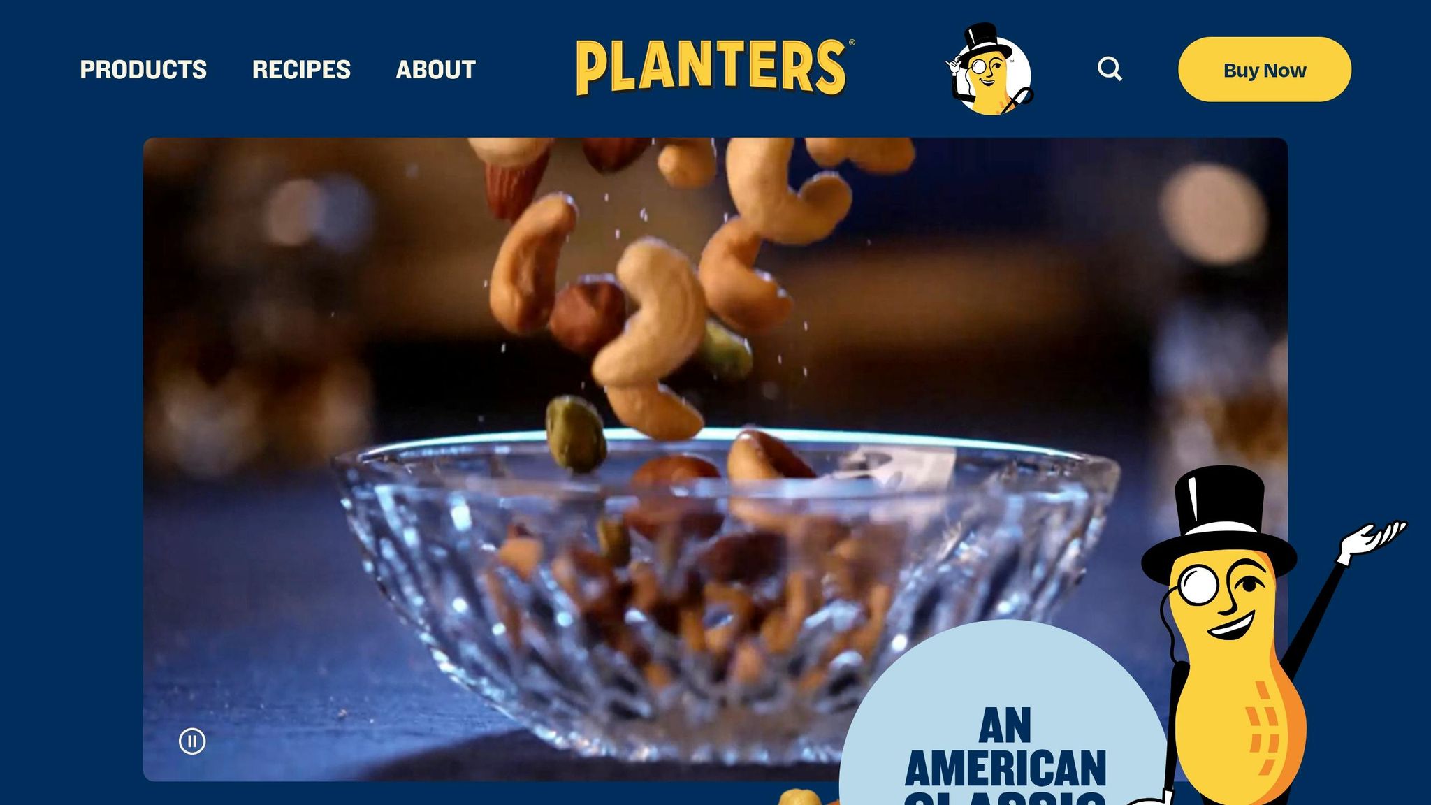
Mr. Peanut has represented Planters since 1916, which puts him among the longest-running ad characters in U.S. history. The first sketch came from a schoolboy, Antonio Gentile, who entered a brand contest and won $5 for the design. Later, a commercial artist added the details people know today: the top hat, monocle, cane, white gloves, and spats.
KFC builds its image around a real founder. Planters takes a different path and turns the product itself into the face of the brand.
Brand Personality
Mr. Peanut’s full name, Bartholomew Richard Fitzgerald-Smythe, leans into the brand’s playful, upper-crust image. His aristocratic look suggests quality and tradition, which helps position Planters as a premium snack. That polished, gentlemanly style also adds a bit of humor. As a result, the brand feels dependable without seeming stiff, and that helps it stand out on a crowded shelf.
Memorability
Using the character for more than 100 years has made Mr. Peanut one of the best-known ad mascots in the country. The 2020 #RIPeanut Super Bowl campaign gave that recognition a big jolt. Online chatter about the brand jumped 2,000%, Ad Awareness among U.S. adults went up 43%, and the @MrPeanut account picked up 24,000 followers. After the brand announced his death, Mr. Peanut also became the top trending topic on Twitter.
Scalability
The main shape is easy to spot: a peanut with limbs, a top hat, and a cane. That means it works well on large packaging and billboards. At small sizes, though, things get tricky. Details like the monocle and spats fade away, so Planters needs a simpler version for app icons and other tiny placements.
Industry Fit
Mr. Peanut is the product, plain and simple, which gives him a very close match with the snack aisle and the peanut business as a whole. That direct link is also the catch. If the brand wants to stretch far beyond peanuts, the mascot doesn’t fit every item as neatly. That’s an important contrast: some mascot logos win because the character is literal, while others work better because they can move across more product types.
3. Aflac Duck
The Aflac Duck first showed up in the “Park Bench” TV commercial in January 2000 to fix a basic problem: not many people knew the Aflac name. Before the campaign, U.S. brand recognition was only about 11%, even after heavy TV ad spending throughout the 1990s. The duck’s loud quack made the name stick. That’s why this mascot stands out as a strong example of how a character can fix a brand-awareness issue.
Brand Personality
The duck comes across as loud, pushy, and a little annoyed when people forget or butcher the name. That comic tone was a clear shift from the serious, gloomy style often seen in insurance ads. Aflac paired a quirky animal with a very simple product message, which made the brand feel more approachable while still keeping the point clear.
Memorability
The campaign delivered sharp results. Brand recognition climbed from about 11% to 71% not long after launch, and later hit roughly 90%. Ipsos ASI said the first duck ads scored more than twice the industry average in brand recall. Aflac leadership has also said that within three years, U.S. sales doubled, while annual new sales growth moved from about 10%–15% to 20%–24%. USA Today’s Ad Track poll also ranked the duck among the most popular ad campaigns of 2000.
Scalability
The duck’s plain design mattered a lot. It was just a white bird, which made it easy to animate, shrink down, and reproduce across more than 100 commercials over two decades. Aflac also pushed the character beyond TV through plush toys, merchandise, and My Special Aflac Duck, a robotic companion for pediatric cancer patients. That range shows how a simple mascot can work in playful ads and in more mission-driven efforts.
Industry Fit
Simple design helped the duck travel across formats, but the bigger reason it worked was fit. Insurance is a serious business, so using a duck was a gamble at the start. The idea worked because the joke always stayed linked to the product. Over time, the character became so tied to the company that Aflac added it to its corporate logo in 2005.
4. GEICO Gecko
The GEICO Gecko came out of a very specific moment: the 1999 SAG strike. GEICO needed a non-human way to keep making commercials, and the company also leaned into a common mistake people made when saying its name. People mixed up “GEICO” and “gecko,” so the brand turned that confusion into the whole idea behind the character. In other words, the Gecko did two jobs at once: he helped fix a naming issue and gave the brand a face.
Brand Personality
The Gecko is built to feel warm and easy to like, not stiff or corporate. He’s a small green gecko with big eyes and a friendly look, which makes him feel approachable right away. His Cockney-style accent, voiced most notably by British actor Jake Wood, gives him a conversational tone that many U.S. audiences saw as trustworthy.
Memorability
When it comes to recall, the data is hard to ignore. A Q&A Research survey found 94% recognition among consumers, the highest among insurance mascots, and placed him in the top three for brand attribution, appeal, and purchase influence. An Ad Age–Harris Poll also found a 75% favorability rating, with 40% of respondents saying they strongly like him.
That kind of performance matters in insurance, where many brands can blur together. The Gecko gives people something simple to remember.
Scalability
The Gecko also works well across different formats because his shape is easy to read. He’s a small upright lizard with large eyes, so his silhouette still comes through at smaller sizes. That helps him move across TV, digital, and social without losing clarity. GEICO uses the wordmark for more formal and small-format uses, while the Gecko takes the lead in larger brand moments.
You can see that range in the numbers too. A digital road-trip campaign featuring the Gecko led to a 101% increase in Twitter followers and more than 1.4 million YouTube views. There’s a clear lesson here: mascot design works best when the character stays simple enough to scale.
Industry Fit
GEICO uses the Gecko to bring some life to a category that can feel abstract and dry. Insurance isn’t exactly dinner-table talk, so a friendly animated character helps make the brand feel less distant. That tone fits because GEICO speaks to cost-conscious everyday consumers, not corporate risk managers. For that audience, a playful mascot makes more sense than a formal spokesperson.
That match between character, audience, and category is a big part of why the Gecko still works.
sbb-itb-ba0a4be
5. M&M’s Characters
M&M’s doesn’t rely on one mascot. It uses a full cast of spokescandies. That gives the brand more room to play than a single character ever could.
Each one is a human-like candy with a name, a voice, and a clear personality. Red is confident. Yellow is friendly. Orange is anxious. Green is playful. A single mascot usually builds one clear identity. A cast can show several at once.
Brand Personality
That mix makes the brand feel broader without feeling scattered. Different people can connect with different characters, which helps more consumers see a bit of themselves in the brand.
It also gives M&M’s a simple way to tell stories about inclusion and belonging. Each character stands for a different personality type, so the brand can speak to a larger group while still feeling like one connected world.
Memorability
The characters haven’t just helped with personality. They’ve also driven strong reach.
A social listening analysis found that in a single 30-day period, M&M’s earned 886.7 million impressions and more than 14,000 mentions, with Red mentioned 220 times and Yellow 72 times. Research on brand mascots applied to M&M’s also found that mascot endorsement leads to stronger attention, appeal, and customer recall than campaigns without mascots.
That makes sense. A cast gives people more than one face to remember, while still tying everything back to the same brand.
Scalability
That same range comes with a tradeoff: the more characters you have, the more expensive change can become.
Still, the design system is simple. Each character reproduces cleanly across packaging, TV spots, point-of-sale displays, and social media without losing clarity. Each one also connects to a product variant, which helps the mascot system scale across the full product line while keeping the brand aligned.
The 2022 redesign also showed the downside of touching familiar mascots. When people already know these characters well, even small updates can spark backlash.
Industry Fit
This approach works so well because candy is usually bought for fun, not function. Colorful, funny characters fit that buying mood almost perfectly.
In the U.S., where Super Bowl ads and seasonal promotions play a big role in snack branding, the spokescandies work like recurring stars. They give M&M’s a steady cast it can bring back across campaigns, packaging, ads, and social posts year after year.
For a snack brand, that kind of repeat use matters. Playful characters are easy to spot, easy to reuse, and easy to build stories around. A cast gives M&M’s more ways to do that than any single mascot could.
6. Pringles Mascot (Julius Pringles)
After M&M’s cast of characters, Pringles is a good reminder that one mascot can do a lot of work.
Julius Pringles has been the face of the brand since 1967, when designer Arch Drummond created the original cartoon character. The whole design leans on one main feature: a bold, stylized mustache. The rounded head, simple eyes, and bow tie all play a support role, giving the character an easy, friendly look.
Brand Personality
At a glance, the character gives off a fun, casual snacking vibe. The oversized mustache, soft shapes, and friendly expression tell you Pringles is about enjoyment, not premium positioning or health claims. Even the internet-shaped backstory fits the brand’s joke-friendly tone.
Memorability
The mustache does most of the work. It’s the first thing people tend to remember. That kind of instant shorthand is hard to get and worth a lot. Over the years, Pringles has changed the hair, cheeks, and outer lines in multiple redesigns, but the mustache has stayed in place, which helps keep recognition steady.
Scalability
The 2020–2021 rebrand dealt with a clear readability issue: the older, more detailed version of Mr. P looked cluttered at small sizes and was hard to read on digital screens. The updated design went flatter, with a bald head, solid black mustache, thicker eyebrows, and fewer outlines, so it holds up better on mobile apps, social media avatars, and smaller packaging formats.
That said, the redesign got mixed reactions because some people felt it looked flatter and more emoji-like. That’s the trade-off. Simple marks tend to travel better across formats, but they can lose some charm along the way.
Industry Fit
For a snack brand like Pringles, a playful cartoon makes sense. The brand competes on fun and flavor variety, not nutrition messaging or high-end ingredients, so Julius Pringles matches what shoppers expect in that aisle. Small facial tweaks can also hint at different flavor moods. A plain wordmark or abstract logo doesn’t give you that same range.
Pros and Cons of Mascot Logos
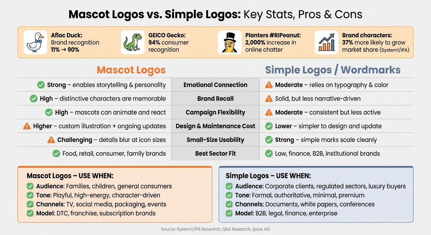
Mascot logos can be a great fit. But they don’t fit every brand.
Their biggest upside is personality. People tend to remember characters more easily than abstract marks, and a familiar mascot can hold a campaign together across TV, social media, and packaging for years. A character can show up in lots of situations, wear holiday outfits, or react to the moment in a way a plain wordmark just can’t.
That said, those same strengths come with tradeoffs. What makes a mascot fun and memorable can also make it more expensive, harder to scale, and tougher to use in serious industries.
Custom character illustration usually costs more upfront than a wordmark or a simple symbol. And the spending doesn’t stop after launch. Mascots often need seasonal versions, animation files, and style updates over time. Detailed characters also tend to struggle at small sizes, which is why many brands create stripped-down versions for app icons and social media avatars. There’s also a brand-positioning issue: once a company leans into a playful character, it can be hard to shift away from that tone later.
The tradeoff is easier to see side by side.
| Aspect | Mascot Logos | Simpler Logos (Wordmarks / Symbols) |
|---|---|---|
| Emotional connection | Strong; characters enable storytelling and personality | Moderate; relies on typography and color |
| Brand recall | High; distinctive characters are easier to remember | Solid, but less narrative-driven |
| Campaign flexibility | High; mascots can star in varied content and animations | Moderate; consistent but less "active" in storytelling |
| Design & maintenance cost | Higher; needs custom illustration and ongoing updates | Lower; simpler to design and update |
| Small-size usability | Challenging; details can blur at icon sizes | Strong; simple marks scale cleanly |
| Sector suitability | Best for consumer, food, retail, supplement brands, and friendly tech companies | Better for law, finance, B2B, and institutional brands |
| Longevity risk | Characters can date or become culturally misaligned | Abstract marks tend to age more gracefully |
This becomes much more important in regulated or reputation-sensitive fields. Law, finance, accounting, and enterprise B2B usually need a wordmark, not a mascot. In those spaces, clients expect signs of stability and seriousness. A cartoon character can work against that.
For remote-first brands, a split system often works best. Use a clean wordmark or monogram as the primary logo – the mark that shows up on articles of incorporation, IRS filings, NDAs, and client contracts. Then use the mascot as a secondary asset on the website, in onboarding flows, on social media, and in internal culture tools.
That setup only works if the rules are clear. Brand guidelines should spell out exactly where each asset belongs, especially when remote teams and outside vendors are making things on their own. Clear rules help the brand stay consistent across every channel.
When a Mascot Logo Is the Right Choice
Those trade-offs lead to a simple rule: use a mascot only if the brand can carry it.
Four things shape that call: audience, tone, channels, and business model. Mascots tend to work best for brands aimed at children, families, or broad consumer groups. On the other hand, conservative B2B buyers, regulated sectors, and luxury brands usually get better results from a clean wordmark. If your brand needs authority, precision, or prestige, the mascot should stay in a supporting role – or come out of the logo entirely.
There is data behind that. Research from System1 and the IPA found that campaigns with a brand character are 37% more likely to grow market share. But there’s a catch: that edge is strongest when the character fits the category. A goofy mascot might help a snack brand. It can hurt a law firm.
Channel fit matters too. Mascots do their best work in video, social media, live events, and packaging, where they can move, react, and become familiar over time. If most of your visibility comes from decks, white papers, or tiny digital placements, a detailed mascot can turn into dead weight. Adobe‘s designer guidance notes that outside of sports, mascots are usually used in supplementary logos, not the main logo.
The business model also plays a big part. Direct-to-consumer, franchise, and subscription brands often get more out of mascots because they help with repeat interactions. Transactional B2B brands usually don’t. And there’s the practical side: mascots need steady spending for new poses, expressions, and usage versions. That’s not a one-time design job. It’s a system you have to keep feeding.
Use the matrix below to map your brand to the right mascot role.
| Business Type | Audience & Risk Level | Brand Tone | Key Channels | Mascot Role |
|---|---|---|---|---|
| Fast food / snack brands | Families, general consumers / Low risk | Playful, high-energy | TV, social, packaging | Primary logo |
| Kids’ products / family entertainment | Children, parents / Low risk | Fun, character-driven | Video, retail, events | Primary logo |
| Insurance / fintech | General adults / Medium risk | Friendly but trustworthy | TV, online video, social | Secondary character |
| SaaS / B2B tech | Professionals / Medium-high risk | Helpful, credible | Website, demos, content | Secondary character |
| Healthcare | Patients, families / High risk | Calm, reassuring | Website, signage, print | Avoid as primary |
| Law / accounting | Corporate clients / High risk | Formal, authoritative | Documents, conferences | Avoid altogether |
| High-end luxury brands | Affluent adults / High risk | Minimal, premium | Editorial, out-of-home, retail | Avoid altogether |
Before you commit, test the mascot at favicon size, on a business card, and in one-color print. If it falls apart in those settings, keep it secondary and pair it with a simpler primary mark.
Conclusion
Mascot logos work best when a brand needs a clear face and a repeatable personality – but only when the character supports the small business branding strategy instead of pulling attention away from it.
Put these examples side by side, and a simple rule stands out: the best mascots are simple, distinct, and easy to reuse. KFC, GEICO, and M&M’s work because each mascot performs well on personality, recall, scale, and category fit. Strong mascots also tend to improve recall and build more of an emotional connection.
That same flexibility can also create risk. A mascot falls flat when it’s hard to read, hard to scale, or out of step with the brand. If the design is too detailed or poorly matched, it can break down at small sizes, in one-color print, or in serious, technical categories.
Use a mascot only when it fits the audience, scales cleanly, and can be used with consistency – otherwise, a simpler mark is the better choice.
FAQs
How do I know if a mascot logo fits my brand?
Start with your brand strategy. Define your personality, the feeling you want to create, and the audience you want to reach. A mascot logo works best when it lines up with those traits and supports your overall market position.
Then look at the practical side. Mascot logos often have more detail, so they need to stay clear at small sizes, still work in black and white, fit your industry’s tone, and avoid conflicts with existing trademarks.
Should a mascot be my main logo or a secondary asset?
It comes down to how complex your brand is and how much room it needs to grow. For early-stage businesses, a wordmark is often the better primary logo. It tends to stay clear at small sizes and remains easy to read across digital platforms.
A mascot can still play a strong supporting role. It works well as a secondary asset, adding personality and helping people feel more connected to the brand, while a simpler logo handles the main day-to-day uses.
How can I test if a mascot logo will scale well?
Make sure the mascot logo stays clear and easy to recognize at very small sizes, like a 16×16 pixel favicon or app icon. At that scale, tiny details often vanish. That’s normal. What matters is that the main look of the mascot still comes through right away.
It also helps to test the logo in black and white. This is a simple gut check. If the design still reads well without color, it’s more likely to hold up across screens, printed materials, and other places where color may not do the heavy lifting.