If people don’t know your business yet, don’t hide your name behind a symbol. For most startups and small business branding, I’d start with a wordmark or a combination logo. A brandmark usually works best later, after people already link the symbol to your company.
Here’s the short answer:
- Wordmark = best when your name needs to be seen first
- Brandmark = best when people already know your brand
- Combination logo = best when you need both name visibility and icon use
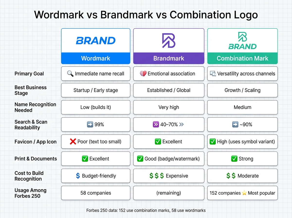
The article’s main point is simple: your logo choice should match brand recognition, screen size, and where the logo appears most. For example, text-only logos struggle at 16×16 pixels, while symbol-led logos work better in favicons and app icons. And among large companies, 152 of the Forbes 250 use combination marks, compared with 58 that use wordmarks.
Quick Comparison
| Logo type | Best for | Main strength | Main limit | Best time to use |
|---|---|---|---|---|
| Wordmark | New businesses | Builds name recall fast | Weak at tiny sizes | Early stage |
| Brandmark | Known brands | Works well in small spaces | Hard to link to a new name | After recognition is built |
| Combination logo | Growing brands | Gives both text and symbol options | Needs a system with more than one version | Growth stage |
If I had to boil it down to one rule, it’s this: use the format that makes your business easiest to recognize today, not the one that looks coolest on its own.
sbb-itb-ba0a4be
Wordmark vs. brandmark vs. combination logo: definitions and real examples
Wordmark: your business name as the logo
A wordmark is a text-only logo built from your business name. The brand work comes from typography, spacing, and color. Think Google, Coca-Cola, or Visa – no symbol, just the name shown in a way people remember.
This setup is often a smart fit for early-stage businesses because it puts your name front and center every time someone sees it. That helps your brand appear clearly in search results, email signatures, invoices, and website headers.
Google’s 2015 redesign kept the wordmark legible on small screens.
That’s why wordmarks tend to work best when getting the name seen is the top goal.
Brandmark: a symbol customers learn over time
A brandmark, also called a logomark, is a symbol-only logo. It works best after customers already know what the symbol stands for. Well-known examples include the Apple silhouette and the Nike swoosh.
Brandmarks shine in small placements like favicons, app icons, and avatars, where text is hard to read. Starbucks made that move in January 2011 when it removed the "Starbucks Coffee" text from its circular emblem and left only the Siren symbol.
For a startup or small business, though, a symbol on its own can be a gamble. People still need to connect the icon to your name, and that connection doesn’t happen overnight.
That’s why brandmarks usually make more sense after brand recognition is already in place.
Combination logo: name and symbol used together
A combination logo pairs a symbol with a wordmark. Adidas, Slack, and Mastercard all use this format.
The big draw here is flexibility. The full lockup works well on websites, documents, and signage. Then, once people know the brand, the symbol alone can do the job in app icons, social media avatars, and favicons.
In plain English: this format helps build name recognition and symbol recognition at the same time, then gives you room to split them apart when needed.
Next, compare how each format performs across business stages and channels.
Direct comparison: strengths, limits, and best use cases
These three logo types do different jobs. A wordmark puts your name front and center. A brandmark leans on the symbol. A combination mark gives you both.
Here’s a quick side-by-side view of the trade-offs, so you can match the format to your business stage and the places your logo needs to show up.
| Feature | Wordmark | Brandmark | Combination Mark |
|---|---|---|---|
| Primary goal | Immediate name recall | Emotional association | Versatility across channels |
| Best business stage | Startup / early stage | Established / global | Growth / scaling |
| Name recognition needed | Low (builds it) | Very high | Medium |
| Search and scan readability | 99% (native OCR) | 40–70% | ~90% (if text is present) |
| Favicon / app icon | Poor (text too small) | Excellent | High (uses symbol variant) |
| Print & documents | Excellent | Good as a badge or watermark | Strong across print and packaging |
| Trademark distinctiveness | Strong | Weaker | Moderate |
| Cost to build recognition | Budget-friendly | Expensive (needs marketing) | Moderate |
Which logo type fits each stage of business
For startups, a wordmark usually makes the most sense because people need to see the name first. If you use only a symbol, you add one more step: people have to connect an unfamiliar icon to an unfamiliar name before recognition can stick.
As a business grows, a combination logo often becomes the better fit. In an analysis of the Forbes 250 largest companies, 152 use a combination mark and only 58 use a wordmark. That’s not random. The combination format helps you build name recognition and symbol recognition at the same time. Later, once people know both, you can split them apart and use each piece on its own when needed.
Moving to a standalone brandmark too early can go sideways. If the audience doesn’t know the symbol yet, the logo asks them to do too much work.
How each logo holds up across websites, social media, documents, and print
The biggest gap between logo types shows up when space gets tight. A wordmark falls apart fast in a 16×16 pixel browser favicon because the text becomes unreadable. A brandmark handles that tiny space much better, but only if customers already know what the symbol stands for.
That’s where a combination logo earns its keep. You can use the full lockup in website headers, invoices, and documents, then switch to the symbol alone for favicons, social media avatars, and app icons. Same brand, different format, no awkward squeeze.
For virtual businesses – especially ones running with a professional U.S. address and digital dashboards – that kind of flexibility is practical. A combination mark with both horizontal and stacked orientations can cover more layouts without forcing a redesign.
In plain English: the best logo type depends less on taste and more on where it has to perform every day.
How to choose the right logo for your business model and brand goals
Pick based on three things: how well people know your name right now, where the logo will show up most, and how much room you need as the business grows. That gives you a simple way to narrow it down fast: name-first, flexible, or recognition-led.
Choose a wordmark if your name needs visibility first
Go with a wordmark when people need to see your business name first. It puts the name front and center in search results, email signatures, and documents. For a new solo service business or consultant, your name is the brand at this stage. A wordmark makes sure people see it clearly every time they come across your business.
Choose a combination logo if you need flexibility across channels
If your brand shows up in a lot of places, the middle option is often the best fit. Choose a combination logo when you need one version for headers and documents, and another for social profiles, favicons, and app icons.
This works well when you need one logo system that can break into two parts: a name-plus-symbol version and a symbol-only version. The key is simple: design it so the wordmark and icon can separate cleanly without looking awkward.
Choose a brandmark if your audience already knows your name
A brandmark usually comes later, not earlier, because it depends on recognition that already exists. A symbol on its own works only when customers already know what it stands for. Mastercard could do this after years of global recognition. Most early-stage businesses can’t.
Before you reach that point, a symbol-only logo can make it harder for people to remember your name.
Conclusion: the clearest path to the right logo choice
After looking at recognition, flexibility, and scale, the right logo format comes down to recognition, not personal taste. If people don’t already know your name, your logo needs to help them learn it first.
Key points to carry into your branding decision
If the answer is no, your logo needs to put the name front and center before a symbol can carry that job on its own. For most startups and small businesses, a wordmark or combination logo is the safest place to start. It keeps the name visible while the brand builds enough familiarity to stand on its own later.
Put simply: start with a wordmark or combination logo when recognition is still low. Use a standalone brandmark only when the symbol can represent the brand by itself.
FAQs
Can I start with a wordmark and switch later?
Yes. A lot of businesses start with a wordmark, then shape their visual identity over time.
A combination mark works well as a middle step. At first, you use the wordmark and symbol together so people connect the two. Later, as more people know your brand, you can use the symbol by itself in small spots like social media avatars or favicons.
How do I know if my brand is recognized enough for a brandmark?
You know you’ve reached brandmark territory when people can spot the symbol and know it’s your company right away, with no text needed.
For most businesses, that doesn’t happen overnight. It usually takes years of steady exposure. If your brand is new or still growing, start with a combination mark. That way, your name and symbol can build recognition side by side until the symbol can stand on its own.
What logo format works best for social media and favicons?
A combination mark tends to work best because it gives you more room to work with. You can use the full logo in main placements, then switch to just the symbol or logomark when space gets tight.
That’s especially helpful for favicons, app icons, and social media profile images, where a full wordmark can get hard to read. It also helps people connect the name with the visual mark while keeping things clear across digital touchpoints.