
An abstract logo makes sense when you want room to grow, work in digital spaces, and build brand meaning over time. If you need people to know what you do at a glance, a literal logo is often the safer pick.
Here’s the short version:
- I’d use an abstract logo for SaaS, online-first brands, consulting firms, and multi-service companies
- I’d avoid it for local services that need fast category clarity
- Shape and color do most of the work
- The logo should still read in black and white, at favicon size, and on invoices, contracts, and email signatures
- Early-stage brands should usually pair the symbol with a wordmark, not rely on the symbol alone
One stat stands out: people can form a first impression in about 0.1 seconds. That means a logo has to read fast, even when it’s small.
A simple way to think about it: abstract logos trade instant clarity for long-term brand memory. If that trade works for your business, this route can be a smart one.
What Abstract Logos Are and Why Brands Use Them
An abstract logo uses nonliteral shapes to show a brand’s values or personality. There’s no apple, house, or camera. Instead, you get a built visual system that hints at ideas like movement, connection, stability, or innovation.
Because the mark isn’t tied to one product, it can grow with the business. That’s a big reason abstract logos show up so often with online-first brands that plan to expand. The tradeoff is simple: the goal is long-term brand association, not instant literal recognition. So the next step is pretty clear – when does an abstract logo make sense?
How Abstract Marks Differ from Pictorial Logos and Wordmarks
Unlike pictorial marks and wordmarks, abstract logos depend on shape, composition, and color instead of a literal image or the company name.
Pictorial and wordmark logos are easier to understand at first glance. Abstract marks usually take more time to learn. But they can also stand out more over time, and they’re less tied to one product or one place. If a brand is fine with that slower learning curve, the next choice is about style: should the mark feel geometric or organic?
Geometric vs. Organic Abstract Logo Styles
Abstract logos usually fall into two broad visual families: geometric and organic.
Geometric styles use exact shapes like circles, squares, triangles, and grids. They lean on clean lines and clear symmetry. That look suggests structure, order, reliability, and precision, which makes it a good fit for tech firms, B2B services, and financial platforms.
Organic styles use irregular, flowing, or curved forms. They feel less rigid and more natural. These shapes point to warmth, imagination, approachability, and a human touch – traits that work well for wellness brands, creative studios, and community-focused apps.
Geometric marks say precise and dependable. Organic marks say human and expressive. The right pick comes down to what the brand needs to project.
sbb-itb-ba0a4be
When an Abstract Logo Is the Right Choice
An abstract logo isn’t for every business. And it isn’t something every brand should rule out, either. The better choice comes down to where the brand is going and how fast it needs people to recognize it.
Abstract logos tend to fit brands built for growth, digital reach, and long-term brand building. So the next step is pretty straightforward: where does this kind of logo make the most sense?
Best Fit for Expanding, Online-First, and Idea-Driven Brands
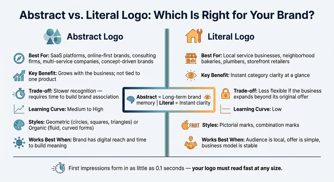
Abstract marks make the most sense when a business is built around an idea, not just one product. A SaaS platform, a remote consulting firm, or a multi-service holding company may need a mark that can grow with the business. An abstract logo can point to the brand’s direction without locking it to a single offer. That matters most when the company may move beyond what it sells today.
They also work best when a brand has the time and reach to teach people what the shape stands for. That’s one reason abstract logos fit digital-first brands so well. Simple shapes usually stay clear at small sizes, whether they show up as favicons, app icons, or social avatars.
That edge starts to fade when a business needs people to understand it right away instead of building that link over time.
When a Literal Logo May Work Better
That said, flexibility has a tradeoff: recognition can take longer. For a local plumber, neighborhood bakery, or similar service business, a direct visual cue is often the better move. A literal logo tells people what you do faster. And when someone is making a snap choice from a local search result or walking past a storefront, that speed can make all the difference.
A simple rule of thumb helps here:
- If your business model is stable
- your audience is local
- and your offer is easy to explain
start with a literal approach.
Abstract works better for growth and brand-building. Literal works better for instant clarity and quick understanding.
How Shape and Color Influence an Abstract Logo
If abstract is the right path, shape and color do most of the heavy lifting. They decide whether a logo feels precise, human, energetic, or calm. They also shape how fast people understand the mark.
That speed matters. A lot of first impressions now happen on phones and laptops, where logos often appear small and for only a moment. Research suggests it can take just 0.1 seconds for someone to form an initial impression of a brand.
What Circles, Squares, Triangles, and Organic Forms Suggest
In the U.S., people tend to connect certain shapes with certain traits. These signals aren’t fixed rules, but they are useful starting points. The final feel still depends on execution, color, spacing, and symmetry.
| Shape | Signals | Best For | Risk |
|---|---|---|---|
| Circle / Oval | Unity, inclusion, continuity | Social platforms, wellness apps, membership services | Can feel generic when overused |
| Square / Rectangle | Stability, order, reliability | Finance, B2B software, legal, logistics | Can feel rigid unless typography softens it |
| Triangle (upward/forward) | Motion, ambition, direction | Tech startups, performance brands, consulting | Sharp angles can feel aggressive, and downward triangles can suggest decline |
| Organic / Fluid | Warmth, creativity, human touch | Creative studios, wellness, eco brands, hospitality | Irregular forms can blur at small sizes and can feel less credible in high-trust categories |
McDonald’s Golden Arches are a good example of how a simple shape can land fast. The mark is clean enough to read almost at a glance, even when it’s small.
How Color Choices Affect Trust, Energy, and Clarity
Once the form is set, color fine-tunes the message. Shape gives the logo its structure. Color gives it mood.
Blue is often linked with trust, reliability, professionalism, and calm. That’s one big reason it shows up so often in finance, tech, healthcare, and enterprise software. The downside? Blue is everywhere. To stand out, some brands pair it with a brighter accent like coral, amber, or lime.
Green often points to growth, health, sustainability, and balance. Red signals energy, urgency, and boldness. That can work well for retail, food, sports, and promotions, but in more sensitive fields, it can come off a bit harsh. Neutral palettes like black, white, gray, and soft beige usually feel clean and polished, which helps explain why so many modern consumer, tech, and luxury brands use them.
Your logo also needs to work in black and white. That’s not a small detail. It’s a practical test.
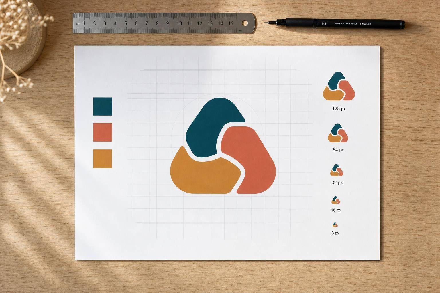
Abstract marks have to survive day-to-day business use, not just polished screen mockups. Invoices, tax documents, scanned mail, and plain printouts are still common across U.S. business operations. If people only recognize the logo because of its color, the mark will fall apart in grayscale. A simple test is to print it on a sample invoice or contract and check whether the silhouette still reads. If it does, you’re on solid ground.
How to Choose or Design an Abstract Logo for Your Business
Start with Brand Traits, Then Choose Form and Color
Before you open a design tool, write down 3–5 core traits that describe your brand. Focus on how you want customers to see you: reliable, efficient, approachable, tech-forward, global. Those traits should guide every visual choice that follows.
A simple way to land on the right traits is to look at three things:
- Your main audience and what they care about
- The main benefit your business delivers
- What your competitors already signal through their visuals
If competitors already lean hard into "secure" and "stable", you may want to stand apart with traits like "friendly" or "human." Once you have your shortlist, connect each trait to a shape style and color system. Geometric forms like squares and hexagons fit traits like efficient or authoritative. Organic, fluid shapes fit traits like warm or creative.
Don’t choose a shape just because it feels trendy. If it falls apart in one color or at a small size, simplify it. After your trait map is in place, check whether it still works in day-to-day business use.
Test Your Logo at Small Sizes and Across Document Types
A logo can look great in a mockup and still fail in normal use. Test it at favicon, app icon, and avatar sizes. Put it next to other app icons on a phone screen and see if the silhouette still reads right away from arm’s length.
Then test it on the files your business sends out all the time, including invoices, letterhead, and compliance forms. For email signatures, export a lightweight PNG – under 50 KB – and make sure it renders cleanly in both Gmail and Outlook, including dark mode.
For file formats, always keep vector source files: AI, EPS, or SVG. That lets you scale from a favicon to a print-ready file without losing quality. Keep PNG exports for web use and a CMYK version for print. Organize everything into clearly named folders – "Web (SVG, PNG)", "Print (EPS, PDF)", "Icons (small PNGs)" – so vendors and team members can use the logo the right way without guessing.
| Touchpoint | What to test | Common failure |
|---|---|---|
| Favicon / browser tab | Simplification at smallest sizes | Shape becomes unreadable blob |
| Mobile app icon | Strong silhouette, high contrast, no text | Fine details disappear |
| Social avatar | Clear shape in a circular crop | Thin edges get clipped |
| Email signature | Lightweight PNG, dark mode rendering | Fuzzy or oversized file |
| Printed invoice / letterhead | Black-and-white vector export | Logo fades without color |
| Compliance documents | Monochrome or simplified version | Inconsistent or illegible mark |
If more than one option still looks good, use a simple scoring system to pick the strongest one.
Use a Decision Matrix Before Finalizing Your Logo
A decision matrix helps you compare logo type, learning curve, and best fit before you commit.
The table below lines up common brand profiles with logo type, learning curve, and best fit. It helps you see when an abstract mark earns its spot – and when another direction may serve you better.
| Brand Profile | Recommended Logo Type | Learning Curve | Best For |
|---|---|---|---|
| New / Startup | Symbol + Wordmark | High – must link name to icon | Building initial trust and name recall |
| Online-First / SaaS | Symbol + Wordmark | Medium – icon alone for small spaces | Favicons, app icons, and website headers |
| Established / Global | Standalone Abstract Mark | Low – icon already carries meaning | Minimalist packaging and premium positioning |
| Concept-Driven Brand | Symbol + Wordmark | High – complex values need context | Communicating abstract ideas through a simple mark |
| Local Service Business | Pictorial or Combination Mark | Low – immediate category clarity | Offline marketing and neighborhood recognition |
Until the symbol has earned recognition, keep the company name beside it. For most early-stage businesses, start with a symbol-plus-wordmark lockup. A standalone symbol usually works only after years of brand-building. Until your symbol can carry that load on its own, keep the wordmark next to it on your website, invoices, email signature, and compliance documents. Save the icon-only version for favicons and app icons, where space is tight.
Conclusion
Once you’ve tested size, color, and document use, one last thing matters: can the logo grow with the business?
Abstract logos are built for the long haul. They give brands room to expand without needing to replace the mark a few years later. That said, they often need time before people recognize them on sight.
A strong abstract logo also needs to work where your brand lives every day: on screens, in documents, and inside small icons. The best marks stay simple and scalable. They hold up across websites, apps, social profiles, invoices, and letterheads.
That’s why flexibility matters more than getting every detail perfect on day one. Abstract logos can change over time. Many brands simplify shapes, tweak proportions, or make small fixes for better legibility while keeping the core symbol the same. Start with a simple mark, then refine it as your business grows.
FAQs
How long does an abstract logo take to build recognition?
There’s no fixed timeline for an abstract logo or brand to become familiar to people. Someone can form a first impression in as little as a tenth of a second, but long-term recognition usually comes from steady, repeated exposure as your business grows.
Trademark registration often takes 8 to 18 months. That process protects your logo, but it doesn’t decide how fast people start to recognize it.
Can a small business use an abstract logo effectively?
Yes. A small business can use an abstract logo to build a brand identity that feels its own without leaning on obvious, literal imagery.
For that to work, the logo needs to be distinctive, simple, and easy to scale across a website, app icon, and packaging. Since abstract marks don’t spell everything out at a glance, they can also be easier to protect through federal trademark registration than generic designs. It’s smart to check the USPTO database for similar marks in your industry before moving forward.
What makes an abstract logo memorable?
An abstract logo is memorable when it’s simple, clear, and easy to spot in its industry. It also needs to work at different sizes and in different places, so it still looks sharp on things like app icons and website headers.
A stylized or geometric design can help it stand out and keep people from mixing it up with other marks. At its best, it becomes a signature for your brand that shows your company’s personality, values, and market position.