
A logo sticks when it is simple, easy to spot, easy to recall, and used the same way every time. I’d judge any logo by five things: simplicity, difference, fit, flexibility across sizes, and feeling. That matters because people form first impressions in about 0.1 seconds, and steady branding can lift revenue by 20%.
If I were checking a logo for my own business, I’d ask:
- Can someone recall the main shape after one look?
- Does it still work at 16–24 pixels?
- Does it fit the industry without looking like everyone else?
- Does it feel right for the brand?
- Will it look good on a site, invoice, email signature, and favicon?
Famous brands show the pattern fast:
- Nike uses one bold shape.
- Apple uses one simple form with one smart detail.
- McDonald’s leans on shape and color.
- Coca-Cola proves a wordmark can stick if the type and use stay the same for years.
Here’s the short version: good logos are not about extra detail. They are about one clear idea used again and again until people link that mark to one business.
| Brand | Main strength | Why it stays in mind |
|---|---|---|
| Nike | Shape | One mark that suggests motion |
| Apple | Form + detail | A plain silhouette with one small twist |
| McDonald’s | Letter + color | Easy-to-see arches in yellow |
| Coca-Cola | Custom type | Same script and red-and-white system over time |
If you want a logo that lasts, I’d start with a clear brand promise, test it for recall and small sizes, then use it the same way across every customer touchpoint.
The Core Traits of a Memorable Logo
Here’s how those five traits show up in real logo design.
| Trait | Effect on Recognition |
|---|---|
| Simplicity | Clean forms are faster to process and easier to recall |
| Distinctiveness | A mark with its own look cuts confusion and gives people a stronger memory cue |
| Relevance | Visual choices that match the brand feel right and help build trust |
| Emotional Resonance | A logo that suggests a feeling gives people something to connect with |
| Versatility | Steady use across formats strengthens recognition over time |
Simplicity and clear visual identity make logos easier to recall
Simplicity is often the shortest path to recall. The brain tends to process clean forms faster, so a logo built around one clear idea, like a shape, letter, or color, is easier to spot after even brief exposure than one packed with competing details.
Here’s a simple gut check: can someone sketch your logo from memory after seeing it once? If not, there’s a good chance too much detail is pulling attention away from the main mark.
Relevance and emotional fit make a logo feel right for the brand
A logo should hint at the brand’s character, not spell out the product. Color, typeface, shape, and spacing all send emotional signals before a customer reads a single word. Rounded forms and warm colors can suggest friendliness, while sharp angles and cooler palettes can point to precision. Strong serif type can feel authoritative, while clean sans-serif type often reads as modern. The key is fit. The logo needs to match both the brand and the people it wants to reach.
A logo that works across formats stays useful at every touchpoint
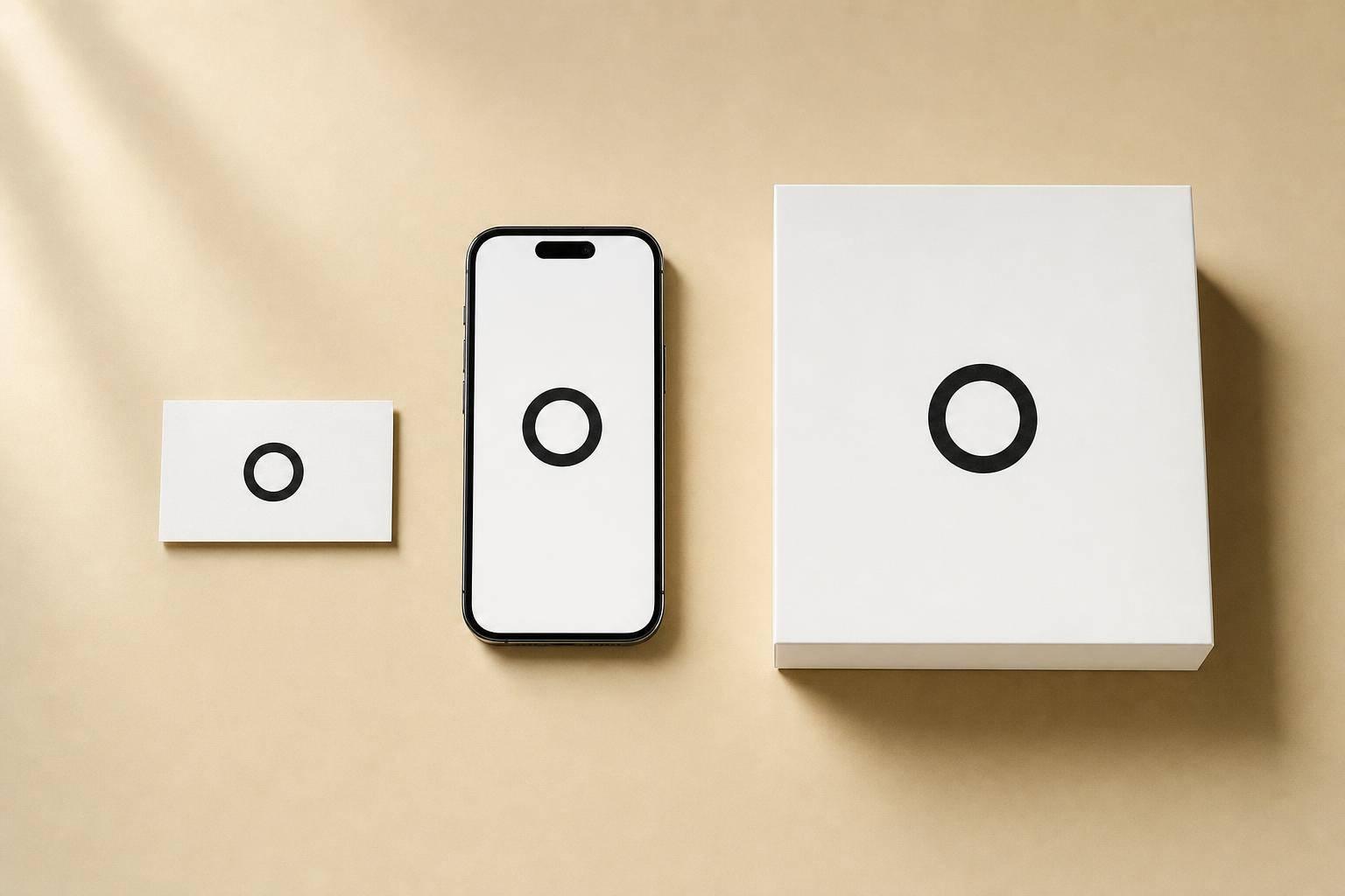
Your logo needs to work on a website, invoice, email signature, and favicon. Start by testing it in black and white. If it falls apart without color, the shape underneath isn’t doing enough work. Then shrink it down to favicon size. If details vanish or text becomes hard to read, it’s time to simplify.
These traits are easiest to spot in brands that have used them well for decades.
sbb-itb-ba0a4be
Lessons From Famous Brands
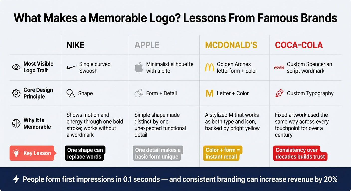
These traits make more sense when you look at logos almost everyone knows on sight. Start with the simplest ones: marks built around one shape, one color, or one central idea.
Nike and Apple: one simple shape, one clear idea
The Nike Swoosh is one curved stroke that suggests speed and forward motion without using text. It’s clean, easy to spot in a split second, and still readable at small sizes or from far away. Nike has used the Swoosh both with and without the wordmark, which shows what happens when a symbol gets strong enough to stand on its own.
Apple follows a similar pattern, but with one sharp twist. The logo is a simple apple silhouette with a bite taken out of the side. That detail wasn’t there just for looks. It helped define the shape and scale so people wouldn’t confuse it with another fruit. Over the years, Apple moved from rainbow stripes to metallic finishes and then to flat monochrome, but the main silhouette stayed the same. The takeaway is simple: one unusual detail on a basic shape can make a mark clear and easy to remember.
If shape drives recall first, color and repetition help lock it in.
McDonald’s and Coca-Cola: color, type, and long-term consistency
McDonald’s Golden Arches work because the “M” does two jobs at once: it reads as a letter and as a symbol. The bright yellow helps people spot it from a distance. Paired with red, the color combo feels warm, high-contrast, and instantly tied to the brand. McDonald’s has made only small refinements to the arches over the decades, so generations of customers have seen almost the same mark on storefronts, packaging, and ads.
Coca-Cola goes in a different direction. Its logo relies entirely on typography. The Spencerian script wordmark is custom-drawn and used the same way across packaging and signage. Add the steady red-and-white color scheme, and you get a visual system so unified that even a partial glimpse can point to the brand.
| Brand | Most Visible Logo Trait | Why It Is Memorable |
|---|---|---|
| Nike | Single curved Swoosh | Shows motion and energy through one bold stroke; works without a wordmark |
| Apple | Minimalist silhouette with a bite | Simple shape made distinct by one unexpected functional detail |
| McDonald’s | Golden Arches letterform + color | A stylized "M" that works as both type and icon, backed by bright yellow |
| Coca-Cola | Custom Spencerian script wordmark | Fixed artwork used the same way across every touchpoint for over a century |
That’s the standard any logo has to meet: simple, distinct, and steady across every touchpoint. These brands are a useful checklist when you look at your own logo.
How to Evaluate or Build a Logo for Your Business
The brand examples above set the bar. Here are three steps to use that same thinking on your own logo.
Define your brand before picking shapes, fonts, or colors
Before you open a design tool or send a brief to a freelancer, write down four things:
- who you serve
- what you promise
- how the brand should feel
- how you sit in the market
This step matters more than most people think. A one-sentence brand promise like fast, hassle-free LLC setup for first-time entrepreneurs in the US gives a designer something clear to aim at. Three to five tone words like professional, approachable, and modern show both what to lean into and what to avoid.
Without that groundwork, design decisions drift into personal taste. And personal taste usually doesn’t build recognition or trust.
Once those brand pillars are clear, turn them into a few plain rules. A serious, trustworthy brand may lean toward clean geometric shapes and a restrained sans-serif or serif typeface. A tight color palette helps too: one primary color, one accent, and neutrals. That keeps the logo readable on both light and dark backgrounds.
Test your logo for recall, scale, and category fit
Three simple tests cover most of what matters. They also reflect what Nike, Apple, McDonald’s, and Coca-Cola already show in the market.
First, test recall. Show the logo to five to ten people for about five seconds. Then hide it and ask them to describe the main shape or sketch it from memory. What they draw is what sticks. Simple logos are recognized faster than busy ones, which is why simpler marks are easier to remember.
Second, test scale. Shrink the logo to 16–24 pixels and place it in a browser tab. If it turns into a blurry blob, the design depends on too much fine detail.
Third, check category fit. Gather 10–20 competitor logos and line them up in a grid. Look for repeated colors, shapes, and type styles. Your logo should feel like it belongs in that space while still having one clear point of difference. You don’t want it so far outside the category that people can’t tell what you do. But you also don’t want it so close to the pack that it fades into the background.
Use your logo consistently across digital and essential business brand assets
Once the logo passes those tests, put it everywhere your brand shows up. Build a logo kit with a primary version, a one-color version, and a compact icon for avatars and favicons. Then use the same files in every template: your website header, email signature, proposals, invoices, and official documents.
That kind of consistency makes every client-facing document look official. It also helps people connect each touchpoint back to the same business.
Before you approve a logo, run through these checks:
- Recall: Can most people describe the logo’s main shape after a brief look?
- Scale: Does it stay clear at favicon size and on a phone screen?
- Category fit: Does it look like it belongs in your industry without blending in?
Conclusion: Simple, Clear, and Consistent Logos Win
The lesson here is pretty simple: the brands in this guide share the same pattern. They start with one clear idea, execute it in a simple way, and stick with it over time. That’s what helps a logo stay in people’s minds.
Minimalist logos are easier to remember.
What matters most is whether your logo feels right for your brand, stands apart, fits the emotion you want people to feel, and works well everywhere people see it, from a website header to an invoice to a smartphone screen.
Consistent branding across platforms can increase revenue by 20%. So use the same logo, colors, and typography across every touchpoint. Over time, that repetition builds recognition.
FAQs
How often should a logo be updated?
There’s no fixed timeline for updating a logo. In most cases, a logo refresh should feel like an evolution, not a total reset.
So instead of changing it on some random schedule, connect major updates to business milestones. That could mean entering a new market, launching a product line, or marking an anniversary.
It also helps to review brand performance on a regular basis. And if a change makes sense, make it gradual. Small, careful updates can help you keep your brand’s core identity, recognition, and trust intact.
Can a text-only logo be memorable?
Yes. A text-only logo can be memorable and effective.
For many startups, a wordmark is a smart early pick. It’s simpler to design, easy to use in spots like website headers and email signatures, and it stays clear across different platforms.
And it can hit just as hard as an icon-only logo. The key is the typeface and styling. If they feel distinct and line up with your brand’s personality, a wordmark can stick in people’s minds.
Should my logo be trendy or timeless?
Aim for a logo that can last, not one built around what’s popular right now. The logos that stick tend to be simple, easy to spot, and flexible enough to work across different places and formats.
A trend-driven logo might look current today, but it can feel old fast. It’s smarter to build around a clear visual identity that reflects your brand story and values. Then, over time, you can make small updates without losing the parts customers already know and trust.