
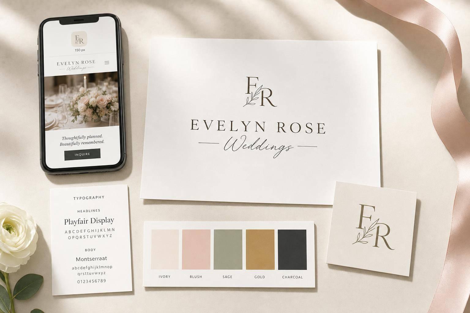
Your wedding logo should do one job fast: tell the right couple, “this brand fits me.” If it fails at small sizes, looks off across your site and Instagram, or sends the wrong price signal, it can cost you inquiries before anyone reads a word.
Here’s the short version:
- I’d start with the niche first, not the logo.
- I’d keep the logo simple, readable, and clear at 150 pixels wide.
- I’d build a full logo set: primary logo, secondary mark, and small icon or monogram.
- I’d match colors and fonts to the couples I want to book, whether that means $5,000–$15,000 weddings or $50,000+ events.
- I’d use the same look across my website, social media, proposals, pricing guides, and email.
The article breaks logo ideas into clear directions, including:
- Classic serif wordmarks
- Script and sans-serif pairings
- Monograms
- Crests and emblems
- Architectural line icons
- Hand-drawn floral wordmarks
- Geometric floral marks
- Signature-style watermark logos
- Editorial all-caps wordmarks
- Nature-based venue logos
- Couture boutique wordmarks
- Abstract arch symbols
- Ribbon or bow accents
- Black-and-white brand systems
- Blush and taupe palettes
- Navy and gold palettes
- Sage and terracotta palettes
- Rose gold boutique looks
- Secondary logo sets
- Cross-platform brand kits
A few points stand out to me most:
- Imagery gets processed far faster than text, so first impressions happen almost at once.
- A thin script may look nice at full size but fail as a watermark.
- If a logo doesn’t work in black and white, the layout likely needs work.
- If your business is online-only, your website and social pages act like your storefront.
Quick comparison
| Focus area | What I’d do | Why it matters |
|---|---|---|
| Niche | Pick one type of couple | Makes design choices easier |
| Logo style | Match style to service and price point | Helps set the right tone |
| Small-size test | Check at 150 px | Stops unreadable watermarks and icons |
| Color system | Use 1 primary, 1 accent, 1 neutral | Keeps the brand clean |
| Font system | Stick to 2–3 fonts | Keeps things easy to read |
| Brand rollout | Update all touchpoints at once | Cuts down on mixed signals |
My takeaway: this piece is less about “finding a pretty logo” and more about building a brand that looks right, feels steady, and filters for better-fit couples from the first click.
sbb-itb-ba0a4be
Clarify Your Niche and Ideal Couples Before Designing
Before you touch colors, fonts, or logo ideas, get clear on who you’re trying to reach. Pick one type of couple and build around them. Amy Brailey, Strategic Brand Designer at Poppyseed Design, says it best:
"Design without strategy is decoration. Design informed by strategy is distinction."
That kind of clarity makes each visual choice easier. It also helps your brand feel consistent instead of all over the place.
Start by defining these four points:
- Wedding style: Fine art/editorial ballroom events, rustic-elegant barn weddings, destination beach ceremonies, adventurous elopements, or sleek city micro-weddings
- Core values: Creativity, reliability, inclusivity, efficiency, or exclusivity
- Service area: Local, destination-based, or virtual
- Budget range: Are your ideal couples spending $5,000-$15,000, or are you aiming for $50,000+ luxury bookings?
The table below works as a quick decision tool for wedding planners, photographers, florists, venues, and boutiques. It connects each niche with design cues that tend to fit that market.
| Wedding Niche | Logo Formality | Font Style | Color Direction | Common Symbols |
|---|---|---|---|---|
| Luxury Ballroom | High | Refined Serif (e.g., Playfair Display) | Blush, Gold, Ivory, Black | Crests, monograms |
| Rustic Barn | Medium | Hand-drawn Script / Serif | Sage, Terracotta, Cream | Florals, botanical patterns |
| Destination Beach | Low-Medium | Clean Sans-Serif | Navy, Sand, Seafoam | Horizon lines, compass |
| City Micro-Wedding | High, modern | Geometric Sans-Serif (e.g., Montserrat) | Black, White, Metallic | Minimalist lines, arches |
| Adventure Elopement | Low | Bold / Adventurous Type | Deep Green, Rust, Ochre | Mountains, trees, geographic shapes |
Once your niche is set, you can move into logo principles that match it.
Core Logo Design Principles for Wedding Brands
A strong wedding logo needs to do five things well: it should be simple, readable, memorable, scalable, and flexible. That last point matters more than people think.
Your logo has to work in a lot of places: print, signage, social media, and watermarks. In plain terms, the same mark needs to look polished on a website header, a printed piece, a sign, and a tiny image in the corner of a photo. Couples should be able to glance at it and feel that your brand looks polished and dependable. That’s the bar every logo style needs to meet.
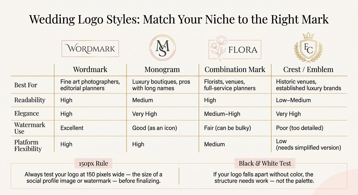
Before you finalize anything, test the logo at 150 pixels wide. That’s about the size you’ll run into for a social profile image or watermark. As Pixels Mark puts it:
"The most common mistake I see is choosing a thin script that looks stunning at full size but becomes completely unreadable as a watermark on a shared image."
It also helps to test the logo in black and white first. If it falls apart without color, the issue isn’t the palette. It’s the structure. That usually points to a layout problem. If the mark works in black and white, you’re in much better shape for the use cases below.
These four logo types fit most wedding brands. The table gives you a quick way to compare them by readability, elegance, and how well they work across platforms:
| Logo Type | Best For | Readability | Elegance | Watermark Use | Platform Flexibility |
|---|---|---|---|---|---|
| Wordmark | Fine art photographers, editorial planners | High | High | Excellent | High |
| Monogram | Luxury boutiques, pros with long names | Medium | Very High | Good (as an icon) | High |
| Combination Mark | Florists, venues, full-service planners | High | Medium–High | Fair (can be bulky) | Medium |
| Crest / Emblem | Historic venues, established luxury brands | Low–Medium | Very High | Poor (too detailed) | Low (needs a simplified version) |
For most wedding brands, a full logo set makes the most sense. That usually includes:
- a primary mark
- a secondary variation
- a smaller secondary mark, like a monogram or icon
Here’s how that tends to play out in day-to-day use: the primary logo goes on your website, the secondary mark fits headers, and the icon handles social profiles and watermarks. Use that setup as a simple way to judge the logo ideas in the next section.
1. Classic Serif Wordmark
If your brand needs to feel timeless and upscale, a classic serif wordmark is a strong place to start. It fits wedding brands that want a polished, old-school look. This style tends to work best for planners, florists, venues, and bridal boutiques that serve upscale or formal couples. Serif type signals tradition and polish, which lines up well with formal or luxury weddings.
Good starting fonts include Cormorant Garamond, Playfair Display, EB Garamond, and Libre Baskerville. Pair the serif with a clean sans-serif for support text. That contrast keeps things refined without feeling stiff. It also helps the main mark do the heavy lifting while the secondary text stays quiet and clear.
One thing to watch: skip overly trendy serif cuts. They can date the logo fast. This style works best when your ideal couples care about tradition, polish, and a formal presentation.
Spacing matters more than people think. Give the letters enough room so the wordmark stays clear at small sizes. Build the final version around spacing, weight, and readability across website headers, social icons, and print. A custom secondary mark, like one flourished initial, gives you a compact option for watermarks and profile images when the full wordmark is too wide.
If you want a softer, more romantic look, move next to a script-led pairing.
2. Romantic Script and Sans-Serif Pairing
Best for: Boutique planners, florists, venues, and luxury micro-wedding brands.
If a classic serif wordmark feels a bit too formal, a script-and-sans-serif pairing can soften the look without losing polish. It gives the brand a gentler tone while still feeling clean and put-together.
The key is simple: each font should have one clear role. The script brings in that handwritten, romantic feel. The sans-serif does the heavy lifting on readability. Used together, they create a style that feels romantic without drifting into something overly old-fashioned or dated.
"Pair a script with a clean sans-serif for a modern yet romantic balance." – Foil & Ink
One mistake shows up all the time with this pairing: adding letter-spacing to a script font. Don’t do that. Script fonts are meant to flow. Spacing them out breaks that rhythm and can make the logo look awkward fast.
Instead, choose a script with even stroke weight, then test the logo at 150 pixels wide. That’s about the size of a social profile image or watermark. If it still reads well there, you’re on solid ground.
From there, carry the same pairing across your brand materials. Use the script for the brand name or a small accent. Let the sans-serif handle the supporting text, pricing guides, Instagram graphics, and signage. That split keeps the brand easy to read across web headers, inquiry forms, social graphics, packaging, and signage.
If you want an even quieter look, the next logo style strips the design down further.
3. Minimal Monogram
Best for: luxury planners, fine-art photographers, high-end venues, and wedding businesses with long names.
When a full wordmark feels too long, initials can do the job better. A minimal monogram turns those initials into a polished brand mark that feels custom-made. That’s why it works so well for long business names, social avatars, and watermarking.
With monograms, letter arrangement matters more than font choice. A refined serif like Playfair Display or custom letterforms can make a simple “AM” feel intentional and elevated.
A modern AM monogram can pair a serif face with a blush palette to create a flexible badge icon. You can carry that same mark across a website header, packaging, and a social profile without losing consistency.
Before you settle on a design, test it at small sizes. Overlapping initials need to stay distinct at 150 pixels wide, especially in profile images and watermarks.
If your brand needs more ornament or structure, the next logo styles add that detail without losing elegance.
4. Elegant Crest or Emblem
Best for: luxury venues, established wedding planners, and bridal boutiques aimed at high-end couples.
If a monogram feels a bit too bare, a crest gives you more structure without giving up grace. This kind of logo uses a contained shape – often an oval, circle, or shield – to frame your brand name, a small icon, and sometimes a tagline. That framed look signals prestige through order, not extra ornament, and it can suggest authority and staying power to couples drawn to tradition and permanence.
For the name, use a refined small-caps serif. Then keep script to one small touch, like an established date or a short tagline. That mix tends to work best when the ornament stays restrained.
Luxury crest logos often feel established and high-end, which makes them a strong fit for wedding brands rooted in heritage.
A strong example is Washington-based venue Chateau Lill. It built its identity around a crest inspired by the property’s family heritage, then paired that crest with custom botanical patterns to reflect its French-chateau heritage in a Pacific Northwest setting. The end result shows how a heritage-based story can turn into a clean, usable emblem – a clear tribute to the brand’s heritage and craftsmanship.
Keep the crest simple. Stick to one or two elements, and avoid details that blur at 150 pixels wide.
If your brand needs a lighter, more modern mark, the next option strips the structure back even more.
5. Architectural Line Icon Logo
Best for: wedding venues, destination wedding brands, and luxury planners who want a mark that feels structural and refined.
If a crest feels too ornate, an architectural line icon gives you the same sense of structure without all the extra detail. It takes an arch, roofline, or doorway and turns it into a clean symbol. The result feels polished, orderly, and refined.
The strongest versions pull from the venue’s actual built form. A venue might turn a historic arch, chapel entry, or gabled roofline into a single-weight line drawing. That kind of mark tends to stay sharp at small sizes, which matters a lot for photo watermarks and wax seals on high-end stationery.
Use SVG files, and test the icon at watermark size before you lock it in. Pair it with a clean sans-serif or an elegant serif to add contrast. This style works especially well when you need one mark that looks polished across signage, websites, and photo watermarks.
6. Hand-Drawn Floral Wordmark
Best for: florists, floral stylists, boutique wedding planners, and independent creatives targeting modern bohemian or fine art wedding markets.
If your brand needs more warmth and handmade charm than a plain line icon, a floral wordmark is a natural next move. It works well for wedding brands that want a soft, artful identity with a handmade feel. You combine your business name with simple botanical details, which creates a romantic, handcrafted look. Done with care, it feels polished. Do too much, and it starts to look crowded.
This style lives or dies on restraint. The floral detail should support the name, not compete with it. Keep the illustration minimal, and use fine line work instead of dense detail. Then pair it with a clean serif or a restrained script so the business name stays easy to read.
That simple approach matters even more at small sizes, where tiny details can vanish fast. Run the 150-pixel test: shrink the wordmark to 150 pixels wide and check whether the floral details and business name stay legible. Leave enough negative space so the mark stays clear.
7. Modern Geometric Floral Mark
Best for: modern wedding planners, eco-conscious florists, editorial photographers, and artistic videographers who want a modern identity.
If you want floral detail without the loose feel of a hand-drawn mark, this style is a smart next move.
A geometric floral mark mixes botanical softness with clean, structured shapes. Think hexagons, overlapping circles, or diamond frames that hold symmetrical leaves or petals. It gives you the warmth of florals, but with a cleaner edge.
As EVR Mag puts it, "This fusion of structure and nature appeals to creative entrepreneurs who style modern bohemian weddings or eco-conscious floral designs."
Geometry can also carry meaning. Overlapping circles may suggest unity, while clean frames can signal balance, movement, and a modern point of view.
Pair the mark with a geometric sans-serif or a restrained modern serif so the full logo system feels aligned. A sans-serif with geometric forms and even stroke weight helps keep the look visually consistent.
Before you lock it in, test the logo at 150 pixels wide. If the lines start to blur, trim back the detail. The mark should stay simple enough to scale well. If you want something even more polished and editorial, then it makes sense to move to the next style.
8. Signature-Style Watermark Logo
Best for: solo wedding photographers, boutique planners, and personal brands where the business owner is the main service provider.
When the brand is built around your name, a signature-style watermark usually feels more personal than a fixed, structured logo. It leans on handwritten script to give the brand a warm, human feel. That works best when the owner is the brand and the logo should feel personal, not corporate.
Legibility matters a lot here. At watermark size, thin strokes can disappear fast on wedding photos. That’s a big deal for photo overlays, reels, and gallery watermarks, where the mark has to stay clear on both light and dark backgrounds.
A readable script like Alex Brush or Dancing Script is a smart pick, then pair it with a small-caps serif for supporting text. Once the script is locked in, package it for actual use across photo watermarks and digital assets.
Export the logo as a transparent PNG for watermarks and an SVG for web and print. That way, the same mark stays sharp on websites, contracts, and social graphics. Then test the final mark over real wedding photos at 40% opacity so it stays visible on both light and dark backgrounds.
Skip rings, cameras, and other add-ons. The signature is the brand. Extra elements should build trust, not pull attention away from your name. From here, the next step is building the supporting logo set and color system that keeps this signature consistent everywhere.
9. Editorial All-Caps Wordmark
Best for: fine art and editorial wedding photographers, luxury planners, fashion-forward bridal boutiques, and urban event stylists who want a clean, magazine-inspired identity.
An editorial all-caps wordmark leans on typography alone. No icons. No flourishes. Just your business name set in polished type with plenty of space around it. It works well for wedding brands that want a magazine-style look without extra decoration. As brand strategist Kaleigh Wiese of Méldeen puts it:
"We really don’t have to try too hard with our logos to feel aesthetically polished."
At that point, spacing and weight carry the design. A lot of the warmth comes from tracking, or the space between letters. Wider tracking gives the mark that editorial feel and signals luxury, restraint, and clarity. A high-contrast serif like Playfair Display or EB Garamond gives the wordmark an editorial look, while a clean geometric sans-serif like Montserrat brings a more modern edge.
If the all-caps name feels a bit strict, you can soften it with a smaller tagline or secondary mark on social graphics, packaging, and lower-priority brand touchpoints. That setup keeps the main mark strong while giving the rest of the brand a lighter feel.
Make sure it stays legible as a watermark, and test it in black and white. If the color has to carry the whole logo, the wordmark itself isn’t strong enough.
If you want more personality on the page, the next logo ideas bring in symbol-led details while keeping that polished look.
10. Nature-Inspired Venue Logo
Best for: outdoor wedding venues, vineyard estates, mountain retreats, barn properties, flower farms, and garden event spaces that want their logo to reflect the physical setting couples are booking.
For venue brands, the strongest logo often starts with the property itself.
Why? Because the mark should tell couples, at a glance, what kind of place they’re booking: a mountain view, vineyard rows, garden paths, or a coastal horizon.
"The logo we created features an outline of the surrounding mountainscape – a grounding element that connects the venue back to its roots." – Hone Creative Studio
The Rockwater used that mountainscape outline with a timeless serif font and a graceful script. It also used a palette of creamy whites and muted blues to give couples a calm, clear first impression.
The strongest versions keep the setting visible without making the logo feel crowded. A good approach is to pair organic illustrated details – like a mountain outline, vine row, or tree line – with clean, high-contrast serif type. Delicate line art works well here, along with colors pulled from the property itself: mossy greens for forest venues, muted blues for mountain views, or petal pinks for flower farms.
It also helps to build a secondary icon, like a single peak, leaf, or arch. That smaller mark can work well on wax seals, profile images, and stationery. If the setting matters less than the venue name, shift toward a typography-first logo style.
11. Couture Boutique Wordmark
Best for: bridal boutiques, dress designers, alterations studios, and bridal stylists who want their brand to feel high-end, editorial, and clearly wedding-focused.
When a bridal business wants the feel of a fashion house instead of a decorative logo, a couture wordmark is usually the cleanest pick. Venue logos often lean on place and atmosphere. Bridal boutique branding is different. It’s product-led, so it should feel like a fashion label, not a destination. If you want the brand to read as polished, fashion-first, and unmistakably bridal, this style fits.
A couture wordmark uses only your business name, set in a refined serif. The beauty is in the restraint. Minimal detail gives it that luxe, editorial look.
"Luxury doesn’t come from adding more decoration. In wedding branding, luxury usually comes from restraint, like clean letterforms, balanced spacing, and small details that feel intentional." – Admin Author, Letter Crafted
Bridal shoppers are looking for fashion, not ornament. So the typography needs to do the heavy lifting:
- High-contrast serif type: Use fonts with a strong shift between thick and thin strokes, such as Playfair Display or Libre Baskerville
- Generous tracking: Wider letter spacing adds breathing room and hints at a premium position
- Custom ligatures: Slight overlaps or connected letterforms can make the mark feel more bridal and more bespoke
- 150-pixel test: Scale the wordmark down to 150 pixels wide. If the thin strokes vanish, the font won’t work well as a watermark or profile image
For color, stick with ivory, champagne, or charcoal as the base palette, and keep metallic gold as an accent only. That gives the mark enough presence for storefront-style touchpoints and enough clarity for small digital uses.
12. Abstract Arch Symbol Logo
Best for: wedding venues, planners, and destination wedding vendors that want a symbol with an architectural, modern feel.
An abstract arch can hint at a ceremony entrance, a sense of place, and new beginnings without leaning on the usual wedding symbols like rings or doves. That makes it a smart fit for venues, planners, and destination wedding brands that want something clean and modern. If a crest feels too formal or a line drawing feels too detailed, an arch often lands in the middle.
As The Logo Company puts it:
"Abstract floral shapes, ribbons, or arches evoke ceremony without cliché."
One recent rebrand used an arch-shaped layout to show movement, distinction, and a nontraditional wedding style.
For the build, keep the line weight thin and consistent so the arch feels light, not heavy. Pair it with a high-contrast serif or a clean sans serif so the mark stays legible at small sizes.
The arch also works well as a secondary icon or watermark, which makes it easy to use across brand touchpoints. If you want a softer, more decorative mark, move next to accent-led logo ideas.
13. Ribbon or Bow Accent Logo
Best for: wedding planners, stationery brands, floral designers, and boutique brands that want a softer, polished identity.
A ribbon or bow accent gives a logo a tactile, celebratory feel without leaning on obvious wedding imagery. The trick is restraint. A single-line ribbon shape usually feels more polished than a detailed bow illustration. It also works best when that ribbon detail can stand on its own as a small supporting mark across print and digital pieces.
Pair the line work with a high-contrast serif or an all-caps wordmark so the logo stays refined, not overly delicate. Champagne tones, soft neutrals, and metallic accents can help push the upscale look. You can use the ribbon to connect letterforms or turn it into a secondary mark for invitation suites, stationery, and favicons. Build it as vector artwork so it stays crisp at small sizes. Then carry that same restraint into supporting marks, so the full brand system feels consistent.
14. Black-and-White Minimal Brand
Best for: fine art photographers, luxury wedding planners, contemporary venues, and couture bridal boutiques that want a timeless, high-end identity.
If your brand needs a cleaner look that will still feel right years from now, black and white is the safest pick. For wedding brands that want a timeless, low-maintenance identity, this style puts the focus on typography. That matters a lot for photographers, because the logo won’t compete with their images.
Here, the type does the heavy lifting. Set the main wordmark in an uppercase serif. Fonts like Garamond, Libre Baskerville, or Playfair Display hold up well over time. Use wide letter spacing and clean spacing to get that editorial feel across website headers, invoices, and watermarks.
Resize the logo to 150 pixels wide. If it starts to lose clarity, simplify the wordmark before you use it as a watermark. Then build the rest of the logo set and brand kit around it so the minimal wordmark works across every touchpoint.
15. Blush and Taupe Romantic Palette
Best for: luxury wedding planners, high-end floral designers, fine art photographers, and boutique stationers.
If your logo starts with a neutral base, blush and taupe can soften the look without making the brand feel young or overly sweet. Warm shades like champagne, blush, and taupe keep things soft, inviting, and upscale.
You can bring in gold or rose gold accents, or ground the palette with mauve or charcoal. The key is to stick with muted tones instead of bright pastels if you want a more timeless feel.
A simple way to use it: make taupe the main wordmark color, then use blush for accents across your logo, social templates, stationery, and website headers. One small catch: light blush scripts can disappear on bright photos. So test your logo on actual photos at 150 pixels wide and at 40% opacity.
Use this palette when you want romance to lead the brand look, then move to the next color system for a more classic direction.
16. Navy and Gold Traditional Brand
Best for: established wedding venues, formal planners, luxury bridal boutiques, and high-end stationers serving couples who want a classic, timeless look.
Navy and gold gives a brand a formal, polished luxury feel. If blush and taupe reads more romantic, navy and gold is the more legacy-driven choice. Navy suggests trust and professionalism, while gold points to luxury and premium positioning. It works well for couples booking formal venues, luxury boutiques, and long-established service brands.
A crest, emblem, or monogram fits this palette well. Keep the layout clean and formal so the mark does the heavy lifting. For the wordmark, use a refined serif like Garamond or Playfair Display, then add a subtle serif italic accent as a secondary touch to soften the overall feel.
For venues, a custom architectural sketch of the property can be worked into the crest. That small detail ties the brand to the place itself and helps root the identity in its setting.
Carry the same navy and gold system across stationery, packaging, and digital assets, and keep hex codes fixed across every file. If your brand feels more organic than formal, the next palette heads that way.
17. Sage and Terracotta Organic Brand
Best for: outdoor wedding venues, bohemian planners, free-spirited garden florists, and adventure-focused photographers serving couples who want a natural celebration.
If you want something softer and more earth-toned than formal navy-and-gold branding, sage and terracotta are a smart match. Sage green suggests nature, growth, and balance, while terracotta brings warmth and confidence. Put them together, and you get a logo palette, type system, and print pieces that feel grounded and human.
When choosing your terracotta shade, go with a muted clay orange like #C67B5C or #A0522D, not anything too bright. That small choice helps the brand stay organic instead of drifting into a rustic look.
For typography, pair a high-contrast serif with a clean sans-serif for support text. That mix helps an organic brand feel polished instead of crafty. For body copy, stick with charcoal (#3D3D3D) or deep brown (#5C4033). Skip terracotta for longer text so the copy stays easy to read and looks polished.
Warm cream or sand works better than stark white here. It keeps the look soft and natural without losing that clean, high-end feel. The same restraint should show up across your logo, social templates, and print pieces too.
Use this palette across the touchpoints people see most:
- Website headers
- Instagram templates
- Pricing guides
- Packaging
- Welcome kits
You can also add uncoated kraft paper textures to packaging and welcome kits to push that organic feel a bit further.
18. Rose Gold Boutique Identity
Best for: bridal boutiques, luxury wedding planners, and florists targeting millennial and Gen Z couples who want a polished, editorial look.
If navy and gold feels a bit too formal, rose gold gives you a softer metallic option. It brings warmth and polish, and it feels modern without looking casual. That makes it a strong fit for boutique wedding brands that want to look current and refined.
One small but important detail: don’t treat rose gold like a flat color block. It tends to look better with a soft gradient that moves from rose gold into champagne and copper. That shift helps mimic the look of real metal and gives the brand more depth.
For typography, pair a high-contrast serif like Cormorant Garamond or Playfair Display for the brand name with a clean sans-serif like Inter or Work Sans for supporting text. If you’re aiming for a modern, editorial style, skip calligraphic script fonts. A custom serif or a clean monogram will keep the look polished and luxe without drifting into something overly ornate.
For contrast, use black or charcoal on website headers, social graphics, and packaging. If you want a softer finish, white or champagne works well too. Metallic foil is best saved for select print pieces, like packaging seals or branded ribbons, instead of being used everywhere. And keep your HEX codes the same across your website and social templates. Use that same color system for your primary logo, secondary mark, and social templates so the metallic tone looks consistent at every size.
19. Secondary Logo and Icon Set
Best for: wedding businesses that need a flexible brand system across Instagram profiles, website favicons, packaging tags, watermarks, email signatures, and printed materials.
A secondary logo, also called a submark, helps your brand stay clear when space gets tight. Think profile images, favor tags, watermarks, and stationery. Your main logo might look great on a homepage or signage, but at small sizes, it can fall apart fast. That’s why a simplified submark should be part of every wedding brand system.
As Kaleigh Wiese, Brand Strategist, Méldeen, puts it:
"A logo should support your brand – not carry it entirely." – Kaleigh Wiese, Brand Strategist, Méldeen
The options that tend to work best are:
- monograms
- simple emblems
- custom icons that match the brand’s style
K.S. Otter Events uses hand-drawn otter illustrations to add a playful note without losing polish. Wild Hare Films includes a crouched hare illustration to signal movement and adventure across the brand.
Before you put any secondary mark into use, test it at small sizes and on top of actual photos. That step matters more than people think. A mark can look sharp on a blank screen and then get muddy on a busy image. Keep the same colors and fonts across each version so the full set feels like one brand. Once the logo set is locked in, you can build the rest of the brand kit around it.
20. Consistent Cross-Platform Brand Kit
Best for: wedding businesses that work with virtual team members or contractors.
Once you’ve set your logo and visual system, put it into a brand kit your whole team can use. A logo doesn’t do much on its own. It needs to be organized, easy to find, and simple to use across every client touchpoint.
A solid brand kit should include your logo suite, color codes, font rules, photo style, templates, and brand voice rules. That includes primary logo, submark, and watermark files in PNG and SVG, plus repeatable business card and packaging templates.
Keep all brand files in one shared kit so team members use the same colors, fonts, and logo files. That way, no one has to make it up as they go. This is especially helpful when contractors, assistants, or remote team members are making graphics, sending proposals, or packaging orders for you.
Look at your website, Instagram, pricing guide, inquiry emails, and proposals side by side to spot drift early. When the same colors, fonts, and imagery show up again and again, your brand becomes easier to recognize and trust. Catch drift before it spreads across your client-facing materials.
Choosing Colors and Fonts That Attract the Right Couples
Once your logo direction is set, choose colors and fonts that back it up. Color shapes first impressions fast. Before a couple reads one word on your site, your palette has already told them something about your brand.
Use a simple setup: one primary color, one accent, and one neutral. Then match that mix to your niche. Blush and gold suggest romance and luxury. Navy and gold feel classic and formal. Sage and cream come across as organic and grounded. Black and slate lean editorial. The palette sections above break down each direction in more detail, so use those as your guide and pick the combo that fits the couples you want to book. Then save your hex codes and use them across every file.
Fonts carry just as much weight. Your type should match your brand personality: serif fonts like Playfair Display or EB Garamond work well for editorial and luxury brands, sans-serif fonts like Montserrat fit modern and contemporary brands, and script fonts add warmth and romance. Keep it simple with two or three fonts total: one for headers, one for body text, and, if needed, one accent font.
Try your fonts in the places where clients will actually see them: your website, an Instagram graphic, a pricing guide, and a proposal PDF. Then keep only the ones that stay easy to read on mobile. If it fails on mobile, it fails.
With your palette and type system fixed, you can use them across every brand touchpoint.
How to Build a Consistent Visual Brand Across Every Touchpoint
A logo on its own isn’t enough. You need a simple brand system that keeps every file, template, and touchpoint in sync. Once that system is set, every client-facing file should follow it.
Use the same system across every surface clients see, from your website to packaging. That same look should show up in contracts, guides, and proposal templates too.
Test every logo at 150 pixels wide. If it falls apart at that size, it’s too detailed for social use and watermarks. When couples see your mark on Instagram, in galleries, and inside proposals, it needs to look solid at every size. In contracts and printed materials, use U.S. date format, such as July 6, 2026.
Consistent branding builds trust, speeds up inquiries, and brings in couples who are a better fit. Here’s what that looks like in practice:
| Element | Consistent Branding | Inconsistent Branding |
|---|---|---|
| Trust | Signals professional expertise and builds confidence | Creates hesitation and quiet doubt |
| Recognition | Becomes recognizable without a name | Blends into the crowded wedding market |
| Sales Cycle | Shorter; couples arrive already understanding your value | Longer; requires more convincing on calls |
The fix is simple: build a brand guidelines document. It should spell out where each logo version goes, which colors show up most often, which fonts handle headers and body text, and how images should be cropped and edited.
If your branding shifts from one place to the next, people feel that friction right away. Trust drops. Inquiries get weaker. The next step is to turn those rules into the files and templates your business uses every day.
Practical Branding Steps for U.S. Wedding Businesses and Virtual Operations
Use your brand guide like a rollout checklist. Start narrow: pick one niche and one ideal client before you open a design tool. Every visual choice should back up that position.
Then choose a logo style that fits the clients you want most. After that, apply your color palette and fonts across your website, proposals, email signature, and social media at the same time. That shared look helps people recognize your business fast.
For remote wedding businesses, presentation goes beyond design. Wedding services are high-trust purchases, so couples look for signs that a business is legitimate and established. A professional U.S. mailing address, a properly formed LLC or corporation, and a registered agent on file all help support that trust. In plain terms: use a U.S. virtual business address, registered agent, and proper entity formation to present a credible business presence online.
Use this checklist to turn brand decisions into action:
| Step | Action |
|---|---|
| Define your niche | Name your ideal wedding type and client before touching any design tool |
| Choose a logo style | Match script, monogram, or wordmark to your brand’s personality |
| Select palette and fonts | Pick colors and typefaces that reflect your niche’s emotional tone |
| Document brand rules | Keep logo, color, font, and image rules in one file |
| Roll out across touchpoints | Apply the brand across your website, proposals, email, and social media |
| Set up your business entity | Register your entity, agent, and mailing address |
Optional Advanced Branding Elements and Brand Protection Basics
After your logo, colors, and fonts are set, add only the pieces that help your brand grow without turning messy. The most useful next step is usually a logo suite:
- a primary logo for your website and proposals
- a simpler secondary mark for small uses
- a monogram or icon for watermarking client galleries
Detailed wordmarks often fall apart at small sizes. So use the version that still looks clear at avatar and watermark sizes.
You can also add brand patterns and custom illustrations to give your website, client materials, packaging, and gifts more depth and a more connected look without changing your core logo. This helps a lot when vendors, assistants, or remote collaborators are handling galleries, packaging, and social content. If several people touch your brand files, even small mismatches can start to show.
When vendors or team members handle your brand, a simple style sheet helps keep every file in line. Share a one-page style sheet with your colors, fonts, logo versions, and usage rules so collaborators stay consistent.
You may also want to look into trademark registration once your name or logo is in regular use across your website, contracts, and social channels. That makes your brand easier to protect as it grows.
Helpful Resources for Branding and Business Setup
A small set of trusted design and business tools can help turn your brand direction into finished assets and a credible U.S. setup. The goal is simple: move from ideas to materials you can use with confidence.
For design, Google Fonts, Pantone, and Canva handle three big jobs: typography selection, color matching across print and digital, and brand template management. Used together, they make it easier to keep your fonts, colors, and logo files in line across every touchpoint.
The U.S. Small Business Administration (SBA) at sba.gov offers funding and mentorship resources that can support wedding business funding and mentorship. The Nielsen Norman Group also publishes research on first impressions and brand trust, which can help you make sharper choices for your website and brand.
For business structure, BusinessAnywhere can help with U.S. business registration, registered agent service, virtual mailbox, and EIN application, all managed from one dashboard. The virtual mailbox gives you a professional U.S. business address without leasing office space. If you run a virtual wedding business, that kind of setup matters. A professional U.S. address, registered agent, and proper entity formation can support trust when couples look up your brand online.
With these resources in place, your brand system is ready for final review.
Conclusion: Create a Wedding Brand Couples Remember
A strong wedding brand comes down to three things: a clear niche, fitting visuals, and steady use across every touchpoint. Each logo style in this article works best when it lines up with the couples you want to book. Use these ideas as a place to start, then shape them into something that reflects your business. Start with the couple you want to attract, and build the logo from there.
That’s why brand choices carry so much weight. As Amy Brailey, Strategic Brand Designer at Poppyseed Design, puts it:
"Your brand speaks before you do."
That line gets right to the point. Before a couple reads your bio, looks at your pricing, or sends an inquiry, your visual identity has already said something about you. And color plays a big part in that first impression. According to Kaleigh Wiese, Brand Strategist and CEO of Méldeen, "90% of snap judgments on a brand are based on color." That’s why simple, readable, on-brand design tends to work best.
The wedding brands that work best don’t try to appeal to everyone. They pull in the right couples and filter out poor-fit leads. That kind of clarity comes from matching your visuals to your niche and using them the same way across each client touchpoint. When your visuals line up with your ideal clients, your brand feels clear, trustworthy, and easy to remember. The goal isn’t to win over everyone. It’s to look right to the couples you want most.
FAQs
How do I choose the right logo style for my wedding niche?
Start with your core values and the feeling you want ideal clients to have, not the latest design trends. That choice sets the tone for everything that follows.
Decide if your brand should feel luxurious, approachable, playful, or modern. That will guide the direction of your logo and make later design choices much easier.
For example, serif fonts can feel refined and trustworthy, while sans-serif fonts often look modern. Keep your logo simple, easy to read, and scalable so it works across platforms and helps build trust.
What makes a wedding logo readable at small sizes?
Keep it simple. Skip busy graphics and heavy textures because they tend to lose detail when you scale them down. Pick fonts with even, steady stroke widths so they still look clean at small sizes. If you use a script font, check that it stays easy to read once reduced.
If your main logo falls apart at smaller sizes, switch to a simpler brand mark for social media icons, watermarks, or website headers. And don’t just guess – test it at 150 pixels wide.
What should a wedding brand kit include?
A wedding brand kit should be the base of your business identity. It needs your primary logo, alternate brand marks, a set color palette, and a typography suite for headings, subheads, buttons, body text, and accents.
A custom brand pattern can add depth to packaging, client gifts, and digital assets. The key is to use these elements the same way across your website, social media, and client documents.