
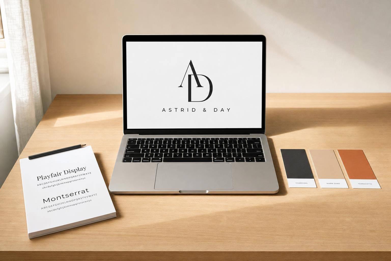
You do not need to spend $300 to $2,500+ to get a logo you can use right now. I’d start with a simple plan: define what the logo should say, pick one logo type, use 1–2 fonts and up to 4 colors, build it in Canva, Adobe Express, or Looka, then export PNG, SVG, and JPG files for web and print.
Here’s the short version:
- I’d use my legal business name in the logo
- I’d pick one clear logo type: wordmark, lettermark, combination mark, or icon-first
- I’d keep the design easy to read at small sizes, like 32–64 pixels
- I’d limit the palette to 1 main color, 1 neutral, and 1 accent color
- I’d test the logo in black and white, on light and dark backgrounds, and on mobile
- I’d save a small brand folder with logo files, HEX codes, fonts, and templates
A strong DIY logo is not about fancy effects. It’s about making something clean, readable, and ready for your website, social profiles, invoices, and email signature from day one.
If I were starting a business today, that’s the path I’d follow.
1. Decide What Your Logo Needs to Communicate
A logo is a first impression, not decoration. And people make that judgment fast. Research shows consumers can form that impression in as little as 0.1 seconds. That’s the standard to use before you pick colors, fonts, or symbols.
Start by writing one sentence that says what you do, who you serve, and the feeling you want to put across. That sentence becomes your filter. If something doesn’t fit, cut it.
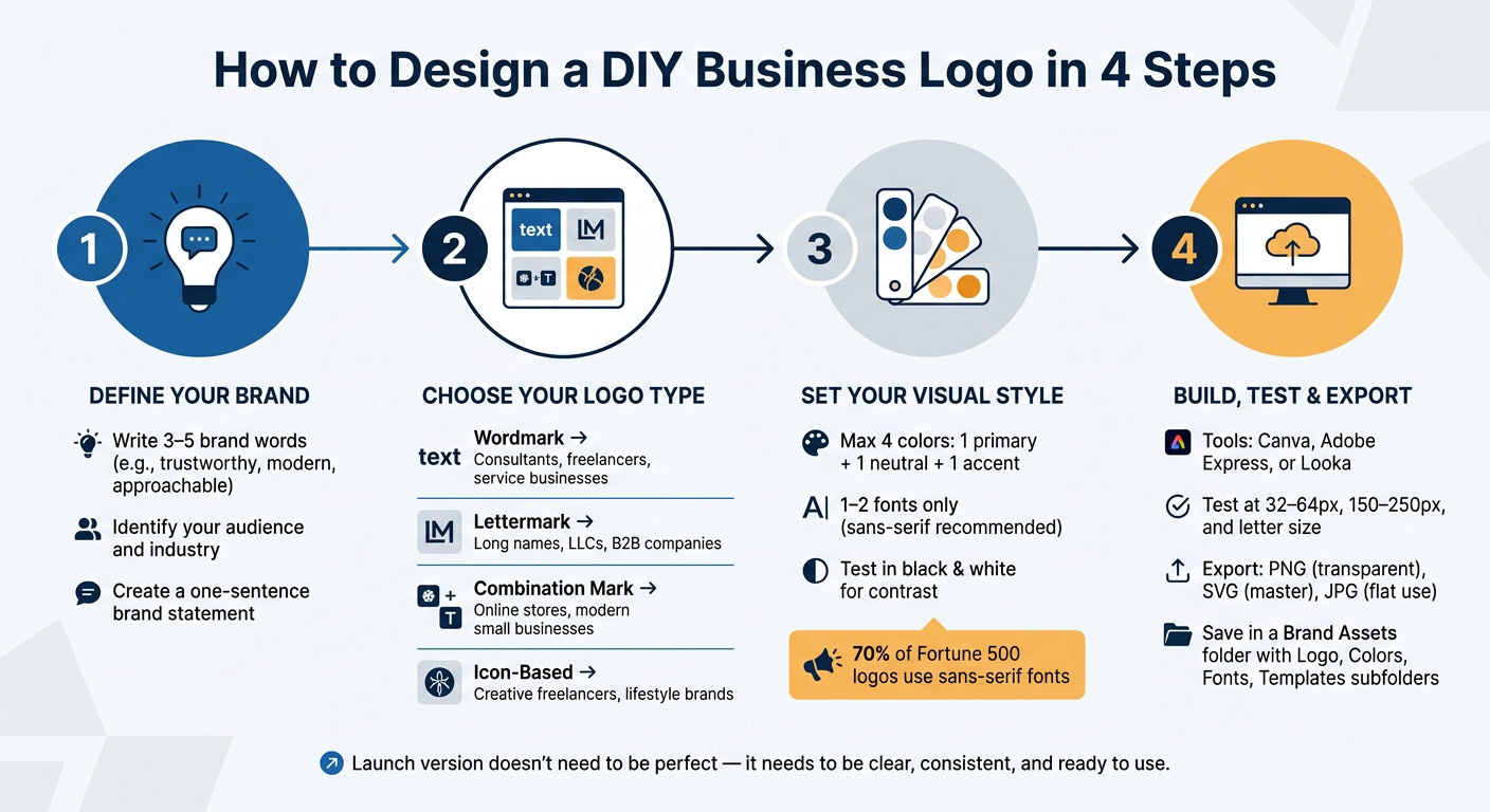
Then write down 3–5 brand words, like trustworthy, modern, approachable, calm, or premium. Add 1–2 tone words to describe the overall feel, such as professional, friendly, premium, or simple. A tax consultant might choose professional and calm. A kids’ craft shop might go with friendly and playful.
Put all of that into a short mini design brief before you open any tool. It doesn’t need to be fancy. A few plain sentences will do. Once you have those brand words in front of you, it gets much easier to pick a logo type that fits.
Choose the Right Logo Type for a New Business
There are four main logo types. Picking the right one matters more than most beginners think.
A wordmark is a text-only logo that uses your full business name. It’s often the clearest pick for consultants, freelancers, and small service businesses where the name itself needs to build recognition. It also stays easy to read on invoices, email signatures, and website headers.
A lettermark uses initials or an abbreviation. This works well for businesses with long names, LLCs, or B2B companies. It feels compact and professional. On your website, pair it with the full business name so people know what it stands for.
A combination mark pairs text with a simple icon or symbol. For online stores and many modern small businesses, this is usually the most flexible route. You can use the full version in one place and split the text and icon apart when space is tight.
An icon-based logo puts a graphic first instead of text. Designers, lifestyle e-commerce brands, and app-first companies often use this style because it gives you a strong visual hook. But there’s a catch: new customers may not connect the icon to your business right away. Until people know it, pair the icon with your business name in website headers and proposals.
| Logo Type | Best For | Key Benefit |
|---|---|---|
| Wordmark | Consultants, freelancers, service businesses | Name recognition, easy to read at any size |
| Lettermark | Long business names, LLCs, B2B companies | Compact, professional, works in small spaces |
| Combination mark | Online stores, modern small businesses | Flexible – use text + icon together or separately |
| Icon-based | Creative freelancers, lifestyle brands, app-first companies | Strong visual identity, memorable at a glance |
After that, narrow the style based on where the logo will show up and who needs to trust it.
Use Your Audience and Industry to Guide Design Decisions
Your audience tells you what the logo needs to earn: trust, excitement, calm, or curiosity. Your industry tells you what people expect. Put those together, and you’ll have a much better sense of how bold or restrained the design should be.
A U.S.-based tax consultant needs a logo that helps clients feel safe handing over private financial information. A wordmark or lettermark usually makes the most sense, set in a clean sans-serif or a conservative serif font. Muted colors like deep blue, charcoal, or dark green help set the right tone. Use white space. Skip playful fonts and clip art. The goal is simple: look dependable from the first glance.
A real estate LLC aimed at homebuyers and property investors needs that same sense of trust, but with a bit more visual weight. A combination mark with a simple house or roofline icon often works well. Deep blues, warm neutrals, and muted gold can signal stability on yard signs, listing flyers, and profile images. Including “LLC” in the wordmark also shows the business is a formal entity.
An e-commerce brand lives mostly on screens, so the logo has to work hard in Shopify themes, Etsy thumbnails, and mobile nav bars. That’s why a combination mark is often the most practical choice. The icon can stand alone on social media and packaging, while the full version sits in the website header. Colors need strong contrast so the logo stays readable on screens, and the icon should connect clearly to the product category.
A creative freelancer – designer, photographer, or writer – has more room to show personality, but clarity still comes first. Start with a clean wordmark in a font that fits your brand words. If you add an expressive detail, make sure it supports the work instead of distracting from it. Keep it light so the logo still works at small sizes on portfolio thumbnails and social profiles.
2. Choose a Style, Color Palette, and Font
Turn your brand words into a simple visual system: one symbol or no symbol, one or two fonts, and a small color palette. Keep it simple enough to work at favicon size. If it looks muddy on mobile, strip it back.
Your logo type gives the design its structure. Style, color, and font give it the right tone. Use the brand words you picked earlier as your filter for each visual choice. Fine lines, gradients, and multiple icons often fall apart on mobile.
A fast gut check: shrink the logo to about the size of a profile image. If you need to zoom in to read the business name, if thin lines vanish, or if two icons are fighting for attention, it’s time to simplify.
Pick Colors That Fit Your Brand and Read Well on Screens
Color does a lot of heavy lifting in a logo. Start with one primary color that lines up with your brand words. Blue signals trust and reliability, which helps explain why it shows up so often in finance and tech. Green suggests growth, health, and sustainability, which makes it a strong pick for wellness or eco-focused businesses. Black and dark gray give off a professional, premium feel. Red brings energy and urgency and is common in food and entertainment. Yellow and orange feel warm and upbeat, so they’re often used by friendly consumer brands.
Then add one neutral, like white, off-white, light gray, or charcoal, and no more than one accent color. Keep the total to four colors maximum. Go past that and the logo starts to feel noisy. It also gets harder to use across platforms.
Once your palette is set, save the HEX codes, like #0044CC, so your colors stay the same in Canva, your website builder, and any other tool you use.
One test every logo should pass: convert it to black and white. If the business name and icon still stand apart in grayscale, your contrast is working. If everything melts into the same gray, one part needs to be much lighter or darker. This matters for invoices, letterheads, and plain office printing, which are still part of day-to-day U.S. business use.
Pick Fonts That Match Your Brand and Stay Legible on Mobile
Fonts shape how your brand feels before anyone even reads the name. Around 70% of Fortune 500 companies use a sans-serif typeface in their primary logo, and the reason is simple: sans-serif fonts are clean, modern, and easy to read on screens of all sizes.
Here’s a plain-English breakdown of the three main choices:
| Option | Best for | Strengths | Drawbacks |
|---|---|---|---|
| Serif | Law, finance, consulting, traditional brands | Formal, established, credible | Can feel dated or dense at small sizes |
| Sans serif | Tech, SaaS, digital services, e-commerce | Clean, modern, easy to read | Can feel generic if overused |
| Script | Personal brands, creative services, boutique businesses | Distinctive, expressive, human | Often hard to read, weaker at small sizes |
If you want specific font ideas, Montserrat, Open Sans, Lato, and Poppins are solid sans-serif picks that render well on screens. Playfair Display, Merriweather, and Georgia are beginner-friendly serifs that still hold up well online. If you want a script touch, Pacifico or Great Vibes are easier to read than most, but keep them to short brand names or a single accent word.
Stick with one primary font for the business name and no more than one accent font for a tagline or secondary element. A pairing like Montserrat Bold for the name and Montserrat Regular for the tagline keeps things clean without clashing. If you want contrast, try a simple sans-serif for the name with a plain serif accent. What you don’t want is two decorative fonts fighting each other.
Test the result on your phone at arm’s length. If you can’t read the business name, the font is too thin, too small, or too ornate.
Keep the Layout Clean and Easy to Recognize
Layout comes down to hierarchy and white space. One element should stand out first, and that’s almost always the business name. Everything else should support it, not compete with it.
Use one symbol. Three symbols crowd the design fast. One bold icon next to your business name is easier to remember.
In Canva or Adobe Express, use the alignment tools to center or left-align the text and icon. Leave at least the height of one letter as empty space between the icon and the text. That bit of padding keeps the logo from feeling cramped.
Avoid thin lines, delicate borders, and tiny taglines. Those details disappear when the logo gets shrunk down to a favicon or printed on a basic office printer. If your tagline becomes unreadable at small sizes, make a version of the logo without it for those cases.
The logo should still read clearly when slightly blurred. That simple test nudges you toward solid shapes, clear edges, and less visual clutter.
Once the logo reads well at small sizes, you can build the final version in Canva, Adobe Express, or Looka. Once the style, color, and font are locked in, the next step is building the logo file itself.
3. Build Your Logo in Canva, Adobe Express, or Looka
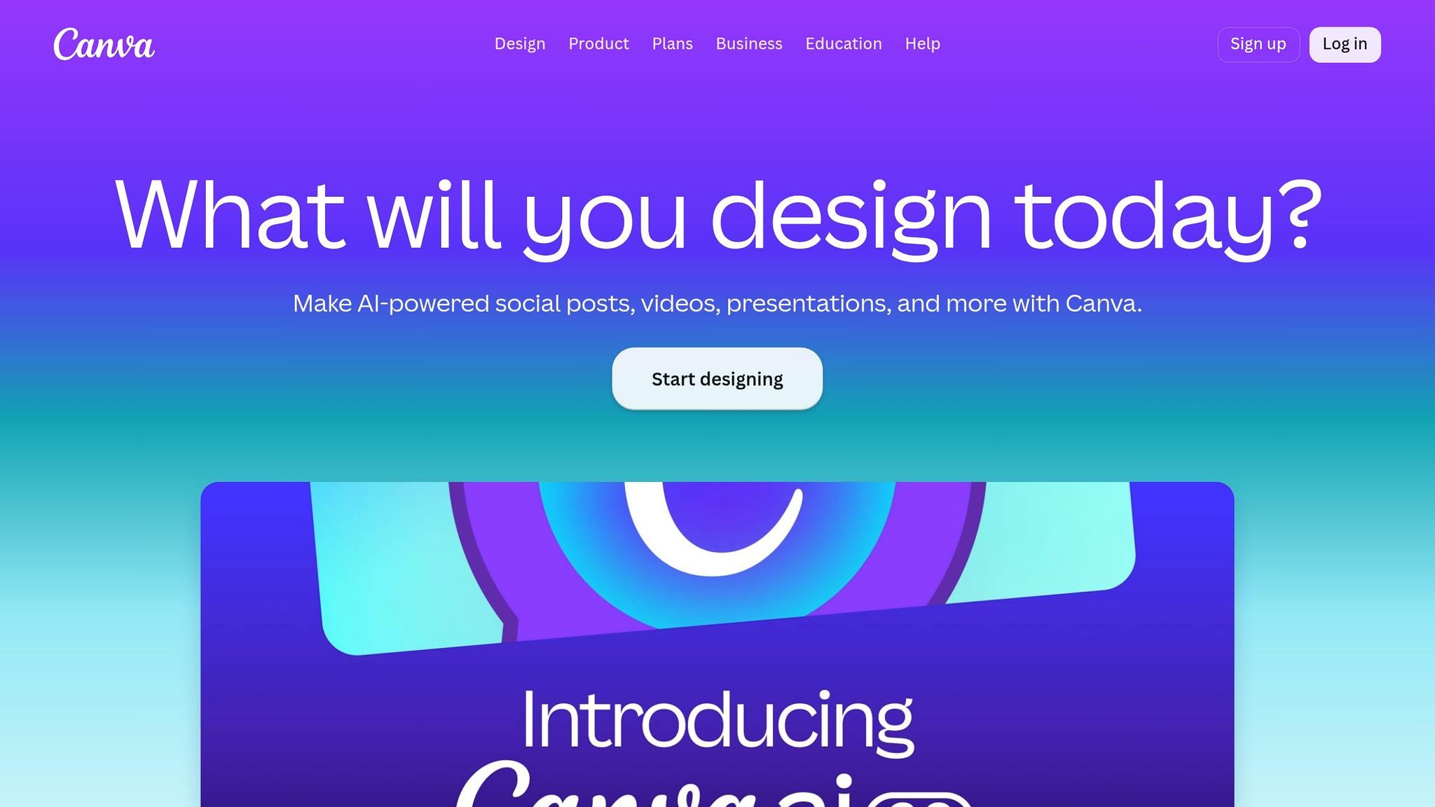
Before you open any tool, get your basics in one place: your exact business name, logo type, hex colors, font choice, and where you’ll use the logo first. That short brief makes the next step much easier. Once you have it, turn those details into a draft inside a logo tool.
Use Canva for Fast Drag-and-Drop Logo Drafts
Open a square logo canvas in Canva and keep your first pass simple. Replace the placeholder text with your exact business name. Then tweak the font, letter spacing, and line spacing until the name is easy to read.
If you want to add an icon, head to the Elements panel and look for a shape that fits your industry. Place it beside or above the name, and use Canva’s alignment guides to keep everything lined up cleanly.
Then do a quick gut check: zoom out. If the name gets hard to read at a small size, fix that now instead of later.
When it’s time to export, choose PNG and switch on Transparent background so the logo works on any background.
If you want to move faster with idea generation, Adobe Express and Looka can help.
Use Adobe Express or Looka to Generate and Refine Ideas Quickly
In Adobe Express, open the logo maker, enter your business name and industry, and review the suggested layouts. From there, swap in your brand font, colors, and icon so the design feels like yours, not a stock template. Export as PNG for web and PDF for print.
Looka works a bit differently. It asks for your brand name, industry, style preferences, and color choices up front, then gives you a batch of AI-assisted logo ideas. Use those as starting points, not finished work. Pick two or three concepts that have the right structure, then edit the fonts and colors to fit your brand palette.
A small warning here: generic icons can make a logo feel flat fast. If you see the usual swooshes or shields, swap them for something that fits your niche better. If you plan to use the logo in print or on signage, Looka’s higher tiers matter because they include high-resolution, transparent, and vector files.
| Tool | Best use case | Ease of use | Customization | Typical output |
|---|---|---|---|---|
| Canva | Hands-on editing with templates | Easy | Moderate | PNG, transparent PNG; SVG availability depends on plan |
| Adobe Express | Fast concept generation plus editing | Easy | Moderate | PNG, JPG; PDF for print |
| Looka | Quick AI-assisted logo concepts | Very easy | Light to moderate | Logo packages with PNG, SVG, EPS, PDF, and color variations in paid tiers |
Align Your Logo With the Rest of Your Business Setup
Use your exact legal business name everywhere the logo appears. That includes your virtual mailbox address, domain, and business correspondence. When those details match, your brand feels consistent from day one.
Also, run a quick search on USPTO before you lock anything in. And if you plan to file a trademark, filing in black and white can give you coverage that extends to color variations.
Once the draft looks close, move on to testing and export.
sbb-itb-ba0a4be
4. Test the Logo, Export the Right Files, and Save a Basic Brand Kit
Before you call the logo finished, test it where it will actually live. A logo can look sharp on a big artboard and then fall apart in a tiny app icon or on a dark background.
Check Legibility, Scalability, and Logo Variations
Test the logo at 32–64 pixels, 150–250 pixels, and letter paper size. Then check it on white, gray, brand-color, and photo backgrounds. If any version gets blurry or starts to disappear into the background, simplify it.
You should also make at least five versions before signing off on the logo:
- a full-color primary version
- a one-color dark version for light backgrounds for invoices and contracts
- a one-color light version for dark backgrounds
- a horizontal layout for website nav bars and email signatures
- a stacked layout for social profile images and square thumbnails
That may sound like extra work, but it saves headaches later. You don’t want to rebuild the logo every time you need it in a new shape or setting.
Export PNG, JPG, and SVG Files for Business Use
Once the logo passes testing, export the files you’ll need for web, print, and social use.
PNG with a transparent background will be your go-to file most of the time. Export it at 1,000–2,000 pixels on the longest side so it stays crisp without making the file too heavy.
Use SVG as your master file. It can scale to any size without losing quality, which matters whether you’re placing it in a mobile app icon, a printed banner, or a trade show display.
Use JPG only when you need a flat, non-transparent file. Never use JPG as your master logo file. It uses lossy compression, doesn’t support transparency, and gets worse every time you save it again.
| Format | Transparency | Best use |
|---|---|---|
| PNG | Yes | Website headers, email signatures, slides, social overlays |
| SVG | Yes | Master file, web logos, icons, scalable print assets |
| JPG | No | Flat social covers, web banners, or blog feature images where the logo is embedded into the artwork |
Build a Simple Brand Folder You Can Use Right Away
Set up one main folder called Brand Assets. Inside it, create four subfolders: Logo, Colors, Fonts, and Templates.
In the Logo folder, save each version with a clear filename, like logo-primary-horizontal.png, logo-white-stacked.svg, or logo-onecolor-black.png.
In the Colors folder, keep a short document with your hex codes for web use, RGB values, and CMYK values if you plan to print.
In the Fonts folder, write down the exact font name, weight, and font license or source.
In the Templates folder, store a branded letterhead, invoice, social post template, and a basic presentation master slide.
Any time you set up a new platform – a business bank account, a LinkedIn company page, or an invoicing tool – pull the logo from this folder only. Add a one-page brand quick guide that lists logo versions, hex codes, and font rules, then share it with any freelancer or partner making materials for the business.
Use this folder as the default home for every new logo file and brand asset.
Conclusion: Launch With a Logo That Is Simple, Clear, and Ready to Use
A finished logo doesn’t have to be perfect. It needs to be clear, consistent, and easy to use across your website header, social profiles, invoices, and print materials. That’s what makes a logo launch-ready.
The process is pretty simple: define your brand, pick a basic logo type, keep your colors and fonts limited, build it in a beginner-friendly tool, test it at real sizes, and export the file types you need. Once those pieces are in place, you have a logo you can start using right away.
It’s smart to treat this as your launch version, not your forever version. You can fine-tune it later or hire a professional for a redesign. But your brand basics – your name, colors, and fonts – will already be set, which makes future updates much easier.
The brand folder you created helps keep everything in line from day one. Each time you set up a new platform, pull from that folder so your brand looks intentional and put together from the start.
FAQs
How do I know if my logo looks too generic?
See if your logo feels original and easy to tell apart. Stay away from overused symbols or common design choices that don’t match your brand’s personality and values. A strong logo should stay simple while still being easy to spot and remember.
You can also check whether it’s already in use by searching the USPTO database and running a reverse image search with Google Images.
Should I include my tagline in the logo?
It depends on your branding goals and how much room you have to work with. The main thing is to keep your logo simple and easy to use, so it looks good on social media, on your website, and in print.
A combination logo can give you more flexibility because it pairs a symbol with your business name. And while slogans have a place in your broader brand identity, your logo should stay clean and distinct. It should reflect your company’s personality and values without feeling crowded.
When should I upgrade to a professional redesign?
Consider a professional redesign as your business grows and your logo needs to perform across more places.
It may be time when your logo starts falling apart in small spaces like favicons or app icons. The same goes if you now need both a full version with the business name and symbol, plus a symbol-only version for tighter placements.
A redesign also makes sense when your brand has changed since the logo was first made. Maybe the old look no longer fits. And if you now have the budget, a pro can help you get better quality, more consistency, and smoother trademark protection.