

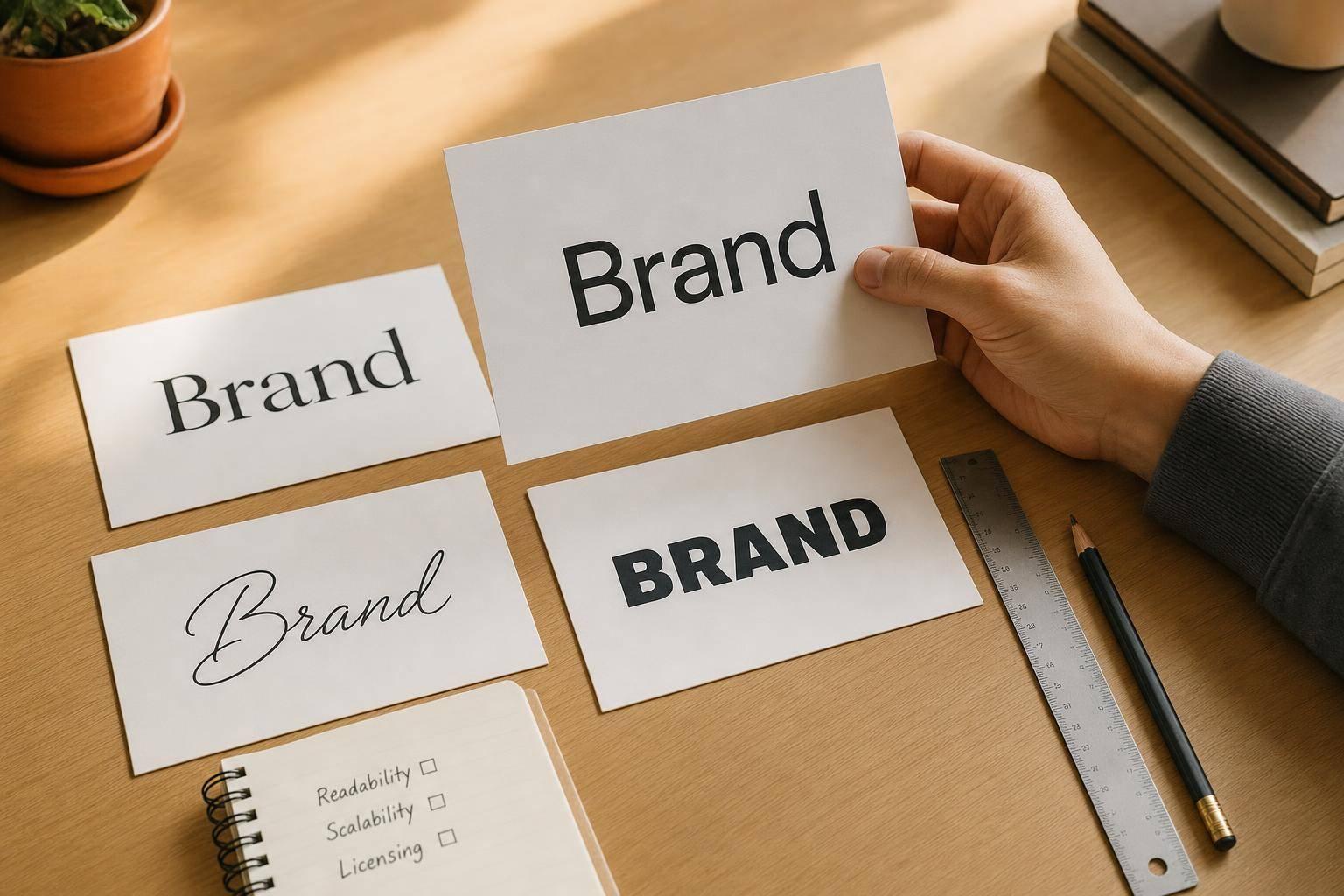
Your logo font should match your brand, stay easy to read, and work at both 12px and 20 feet wide. If it fails at small sizes, looks off in black and white, or feels wrong for your industry, it’s the wrong pick.
Here’s the short version:
- Serif fonts fit brands that want a polished, established look
- Sans serif fonts fit brands that want a clean, current look
- Script fonts add warmth and style, but can get hard to read fast
- Display fonts stand out most, but often struggle when scaled down
I’d judge any logo font with four checks:
- Brand fit – does it match your brand tone?
- Readability – can people read it at a glance?
- Scalability – does it still work at favicon size and on large signs?
- Industry use – does it feel right for your market?
One stat stands out: in a study of 128 SaaS logos, 93% used sans serif fonts. That tells me one thing fast: if your brand is digital-first, sans serif is often the safest place to start.
Quick comparison
| Font style | Best for | Main risk | Best use cases |
|---|---|---|---|
| Serif | Brands that want polish and authority | Thin details can blur at small sizes | Law, finance, luxury, editorial |
| Sans serif | Clean, modern wordmarks | Can feel plain without custom spacing or edits | Tech, health, retail, media |
| Script | Warm, expressive branding | Low readability, weak small-size use | Beauty, weddings, boutique brands |
| Display | Bold visual impact | Often weak for small logos and long-term use | Entertainment, fitness, media, lifestyle |
A few simple rules matter most:
- Test fonts at 12px, 48px, and 200px
- Check the logo in black and white
- Keep it to two fonts or fewer
- Fix kerning by hand if spacing looks uneven
- Confirm the commercial license before you use the font
If I had to boil the full article down to one point, it’s this: start with brand personality, then test the font in daily use cases before you commit.
sbb-itb-ba0a4be
1. Serif Fonts
Serif fonts feel established and dependable, which is why they show up so often in law, finance, and consulting. Those small strokes at the ends of letters give the type a formal, polished look that signals credibility. Transitional and contemporary serifs also carry a sense of heritage, so they work well for law firms, financial brands, and luxury services. Across the four criteria, serifs tend to score best on brand fit, though readability and scaling still depend on the exact typeface.
The best serif comes down to how formal or dramatic the brand wants to feel. Garamond and Baskerville are safe picks for logo work. Garamond is a classic serif with an elegant, refined tone, and brands like Rolex and Abercrombie & Fitch use it. Baskerville feels more authoritative, with sharper contrast between thick and thin strokes, which makes it a strong match for legal and financial wordmarks.
For luxury brands, Didot and Bodoni push that high-end feel further. Vogue and Giorgio Armani use Didot, while Gucci uses Bodoni. The tradeoff is simple: their very thin strokes can get hard to read at small sizes.
That’s the main weakness of serifs. They can look premium, but they lose clarity faster than simpler styles when scaled down. A good test is to shrink the logo to favicon size. If the serifs start to blur or fill in, the font is too detailed for small digital use. In print, especially on business cards, medium or bold weights usually hold up better than hairline styles because thin strokes can blur or vanish on textured paper.
One more thing matters here: kerning. Default spacing is made for body text, not logos. So when letters like “A” and “V” sit next to straight vertical forms, awkward gaps can appear and make the wordmark feel unfinished. Manual kerning fixes that. It’s often the difference between a plain wordmark and one that looks polished.
If the brand needs something cleaner and more current, the next route is sans serif.
2. Sans Serif Fonts
Sans serif logos usually feel cleaner, lighter, and more current than serif logos. They drop the serif strokes and leave you with clean letterforms and a more even weight. That stripped-down look is a big reason they show up so often in tech, retail, and media. In one study of 128 professionally designed SaaS logos, 93% used sans-serif typefaces.
They also travel well. A sans serif mark is often easier to reproduce across screens, print, and signage without losing its shape. If a brand wants clarity and a digital-first look, this style is often the default choice. In most cases, sans serifs do well on readability and scaling. The bigger question is brand fit: does the type feel geometric, neutral, or rounded?
Helvetica comes across as neutral and professional, but it often needs custom letter edits if you want it to feel less generic. Futura goes in another direction. Its strict geometric forms give it a confident, modern feel, which makes it a good match for brands that want precision and a sharper edge. Montserrat lands somewhere in the middle. Its circular bowls in letters like "O", "C", and "G" make wordmarks feel more approachable without giving up that modern look. It’s also free for commercial use through Google Fonts under the SIL Open Font License.
Brand tone should guide the pick. Geometric sans serifs tend to signal precision and innovation. Rounded styles feel softer and easier to approach. Proxima Nova, used by BuzzFeed, NBC News, and Wired, leans friendlier and more editorial. Rounded sans serifs often suit wellness and consumer brands that want a softer tone.
A simple rule helps here: test the font at 12px, 48px, and 200px before you commit. Sans serifs usually scale well, but odd proportions or tight spacing can still fall apart at small sizes. For wordmarks, slightly tighter tracking can improve density and make the logo feel more confident. Next, script fonts shift the focus from clarity to personality.
3. Script Fonts
If serif and sans serif feel a bit too neutral, script fonts bring more personality – but you pay for that with less clarity.
Script fonts echo handwriting. That gives them warmth and charm that serif and sans serif styles usually don’t have. Because of that, they fit brands that want to feel warm, familiar, or tied to a long story. You’ll see them most often in beauty, weddings, fashion, and luxury. That human touch is a big reason brands in those spaces pick script over cleaner styles.
The two main categories are formal script and casual script. Formal scripts – think Cartier or Cadillac – feel ornate and artistic, which signals luxury. Casual scripts, like those used by Virgin or Ray-Ban, feel closer to actual handwriting and can come across as bold, friendly, or a little edgy. Use formal scripts for luxury and heritage. Use casual scripts for approachable, more expressive brands.
Specific font picks matter a lot here. Pacifico has a retro 1950s warmth that works well for cafes and casual expressive brands. Great Vibes is calligraphic and elegant, which makes it a strong choice for wedding services and beauty brands. Rochester, inspired by Victorian and Art Deco calligraphy, fits professional services like consultants or lawyers. Before you use any font in a logo, check the license.
The biggest issues with script fonts are readability and scaling. Extra flourishes can muddy letterforms, and thin strokes or joins often blur together in favicon-size uses. At small sizes, script falls apart faster than simpler styles. That’s why script logos usually need a stripped-down monogram or symbol for social avatars, where full wordmarks lose clarity. And one rule is pretty simple: never set a script font in all caps. The overlapping flourishes make it almost unreadable.
To keep things readable across packaging, signage, and digital use, pair the script name with a clean sans serif for taglines or subtext. Also, don’t mix two script fonts in one logo. It tends to look cluttered.
When script feels too familiar or too delicate, display fonts push personality even further.
4. Display Fonts
Display fonts help brands stand out. But they also push readability and scaling harder than serif or sans serif options. That’s the tradeoff: a font that looks great in a big headline can fall apart once it gets smaller.
Bebas Neue is a good example. Its condensed, all-caps build gives wordmarks a bold, high-impact look, which makes it a natural pick for brands that want energy, confidence, or speed. Since it works in all caps only, it usually needs a simpler supporting typeface for secondary text. Designers also often tighten the tracking a bit to make it feel denser.
Cooper Black has a soft, retro mood. Bodoni feels dramatic and fashion-led, which helps explain why it shows up so often in fashion branding instead of the heritage-focused use cases covered in the serif section. That visual punch comes with a cost: readability tends to drop fast when the logo shrinks.
Before you commit to a display font, test it at small sizes. If it stops being legible when scaled down, it’s not ready for logo use. In that case, you’ll need a simpler alternate mark, such as an icon or monogram, for small-scale placements.
Display fonts tend to work best in:
- entertainment
- fitness
- automotive
- media
- lifestyle branding
They’re usually less suited to finance and law, where clarity and neutrality matter more. Use them only when the logo needs maximum visual impact.
That tradeoff becomes easier to judge in the pros-and-cons breakdown that follows.
Pros and Cons of Each Logo Font Style
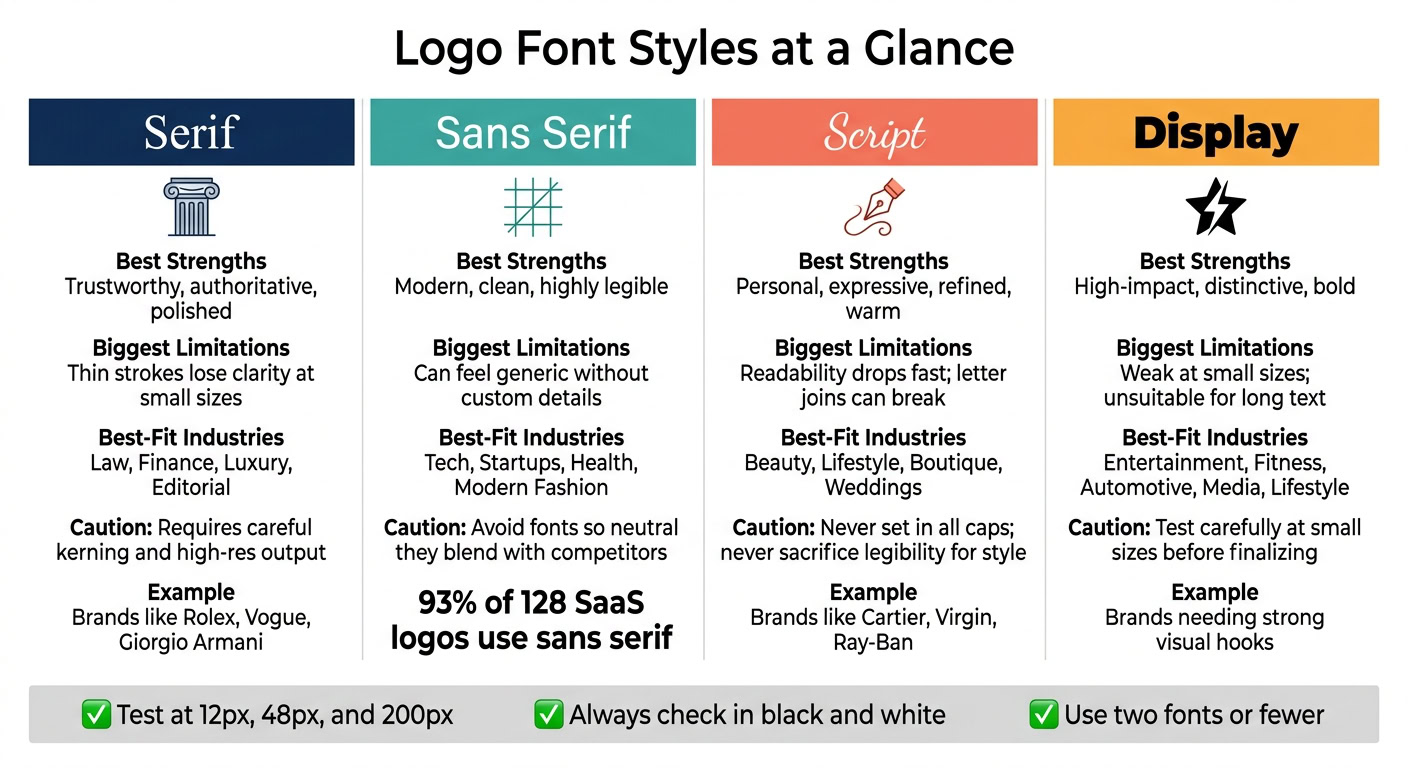
Use the chart below to compare each font style by brand fit, readability, and scale. Now that each font style is defined, this summary helps you pick the one that fits your brand fast.
| Font Category | Best Strengths | Biggest Limitations | Best-Fit Brand Types | Caution Notes |
|---|---|---|---|---|
| Serif | Trustworthy, authoritative | Thin strokes lose clarity at small sizes | Law firms, finance, luxury, editorial | High-contrast styles require careful kerning and high-resolution output |
| Sans Serif | Modern, clean, highly legible | Can feel generic without custom details | Tech, startups, health, modern fashion | Avoid fonts so neutral they blend in with other brands in the category |
| Script | Personal, expressive, refined | Readability drops fast; letter joins can break | Beauty, lifestyle, boutique, goods | Never sacrifice legibility for style |
| Display | High-impact, distinctive | Weak at small sizes; unsuitable for long text | Entertainment, marketing, brands that need a strong visual hook | Best for short wordmarks; test carefully at small sizes before finalizing |
A simple rule works well here: pair one expressive font with one neutral sans serif to create contrast and hierarchy. You can also stay within one font family and use weight to do the work, with a heavy style for the brand name and a light style for the tagline.
Keep the logo to two fonts or fewer. And before you lock anything in, test it in black and white. If it falls apart without color, that’s a red flag.
Conclusion
Start with personality, not looks. Write down 3–5 words that describe your brand’s character – words like “trustworthy,” “playful,” or “technical” – then match those traits to a font category. Use the same four filters from the article – brand fit, readability, scalability, and industry use – to narrow your options. That helps keep the logo in line with both your brand’s personality and what your audience expects.
Once you’ve picked a category, choose 3–5 font options and test them in actual mockups. Put each one on a website header, a business card, and a social avatar. If a font becomes hard to read at about 0.5 inch square, it’s probably too complex for day-to-day use. Then put those finalists through one more check at both small and large sizes.
Run a final size check at 12px, 48px, and 200px. Test each font at those sizes to make sure it keeps its shape. That range covers the smallest digital uses and the largest physical applications.
Then check contrast and licensing before you lock it in. Test the font in black and white, and against dark backgrounds. Also confirm the commercial license; Google Fonts are generally covered by the SIL Open Font License. If a font clears those checks, it can support your brand across every touchpoint. That gives you logo type that stays consistent wherever your brand shows up.
FAQs
How do I know if a logo font fits my brand?
Start by defining your brand personality. Maybe it feels serious, playful, minimalist, or luxurious. Then choose a font that matches those traits.
Your font should also make sense for your industry while still being distinctive and memorable. In plain English: it needs to feel like you, not like a generic pick.
Next, test it for legibility at both small and large sizes. Make sure it works well on digital screens, in print, and in black-and-white layouts so your brand identity stays consistent wherever it appears.
What font style works best for a digital-first brand?
For a digital-first brand, a sans-serif typeface is often the best pick. The letterforms are clean and simple, so they stay easy to read across screen sizes, from tiny mobile favicons to big website headers.
Sans-serifs also tend to feel modern, efficient, and neutral. That’s why they’re such a common match for tech companies, startups, and digital services. Popular choices include Montserrat, Proxima Nova, and Roboto.
Should I customize a font for my logo?
Tweaking a font can go a long way if you want a brand to feel memorable and easy to spot at a glance. If your budget allows, it’s smart to work with a designer on a custom wordmark or to adjust an existing font so it feels like your own.
If that’s not in the cards, pick a high-quality typeface with some personality. Just make sure it stays readable and scales well everywhere, from favicons to large screens.