

Most ads fail for a simple reason: they try to say too much, to too many people, with no clear next step. The ads that work tend to do 5 things well: speak to the right person, focus on one promise, show proof, use strong visuals, and ask for one clear action.
If I had to boil the whole article down, it would be this:
- One ad = one main idea
- Specific claims beat vague claims
- The offer should be clear in about 3 seconds
- Proof helps people believe the message
- A direct CTA beats a generic button
- Message match matters: the ad and landing page should say the same thing
A few numbers stand out:
- A 1% lift in CTR can link to a 15% to 20% drop in CPA
- Claims with numbers can convert 68% better than vague claims
- On mobile, ads often have under 2 seconds to earn attention
- People can decide whether to keep watching in under 400 milliseconds
In plain English: good ads are clear, specific, and easy to act on.
I’d use this simple lens before spending even $1:
- Who is this for?
- What problem does it fix?
- What result am I promising?
- What proof do I have?
- What should the person do next?
A fast way to judge any ad:
- If the headline is vague, it will likely get ignored.
- If the visual is generic, it will likely blend in.
- If the CTA is weak, clicks and leads will drop.
- If the landing page shifts the message, conversion rate will suffer.
Search, social, display, and video all follow the same core rule: make the message easy to grasp fast. Search ads should line up with intent. Social and display ads should lean on the image and keep copy short. Video ads should hook at the start, show the brand early, and end with one spoken and on-screen CTA.
Here’s the short version of what strong ads do better than weak ones:
| Area | Weak ads | Strong ads |
|---|---|---|
| Message | Vague, broad, cluttered | One clear promise |
| Audience | Talks to everyone | Speaks to one buyer |
| Proof | Big claims, no support | Data, reviews, or results |
| Visuals | Generic and easy to skip | Clear and fast to grasp |
| CTA | “Learn More” with no context | Direct next step |
My takeaway: if you want better ad results, don’t start by adding more. Start by cutting. Cut extra claims. Cut mixed messages. Cut weak CTAs. Then make the core offer clearer, sharper, and easier to trust.
That’s what tends to separate ads that waste budget from ads that bring in leads and sales.
The 5 Principles Behind Effective Advertisements
These five levers turn attention into clicks and leads: clear messaging, the right audience, a strong value proposition, memorable creative, and a clear CTA. Miss just one, and results can slip fast. Here’s what each one looks like in practice.
Clear Messaging and One Main Idea
The best ads follow the Rule of One: one audience, one problem, one solution. That sounds simple, but a lot of ads miss it. They try to say too much at once, which splits attention and weakens the strongest point.
Specificity also matters a lot. Claims with numbers convert 68% better than vague promises. So instead of saying “Get better results,” say what the offer actually does. A quick gut check: show the ad to a stranger for three seconds and ask them to explain the offer. If they can’t do it, the message is too cluttered.
Once the message is clear, the next step is making sure it reaches the right buyer.
Audience Targeting and a Strong Value Proposition
Good ads match the message to a specific audience’s problem, goal, or identity. For small businesses, that usually means defining a clear ICP instead of trying to appeal to everyone. If you talk to everybody, you often end up connecting with nobody.
A strong value proposition is a practical, credible benefit, not a mission statement. Put plainly, it should answer: Why should this person care right now? One useful way to get there is to turn each feature into:
- A functional benefit
- An emotional payoff
That’s the bridge between what your product does and why someone would want it.
Memorable Creative and a Clear Call to Action
Visuals need to stop the scroll. If they don’t, the rest of the ad doesn’t get a chance. Visual hierarchy, using size and contrast to guide the eye, helps the most important information get noticed first. For small businesses, real photos of the team or actual work often beat generic stock images because they improve trust and clarity.
A lot of ads also fall apart at the CTA. Usually, the instruction is too vague or too broad. The CTA should match the user’s intent and where they are in the buying journey. For example, “Learn More” fits new audiences, while “Shop Now” makes more sense for people who already know your brand.
It also helps to be concrete. “See how the audit works” or “Book a 20-minute demo” gives people a clear next step, which works better than a generic “Sign Up”.
When these pieces break down, the ad becomes easy to ignore. Ads that miss these basics often look busy, vague, or forgettable.
sbb-itb-ba0a4be
What Weak Ads Get Wrong
Most weak ads don’t fail because the product is bad. They fail because the ad says the wrong thing to the wrong person in the wrong way. And each of those misses ties back to one of the five principles above.
A lot of weak ads lead with the business instead of the customer. They talk about years in business, feature lists, or awards before they speak to the problem the buyer wants fixed. That’s a mistake. If the ad doesn’t make that clear fast, people scroll past or move on. On mobile feeds, ads have fewer than 2 seconds to earn attention.
Weak ads also try to do too much at once. One ad pushes price, quality, speed, and a special offer all in the same space. The result? Nothing sticks. When every point fights for attention, the message gets muddy.
The CTA can make things worse. Generic prompts like "Learn More" don’t tell people what happens next. And when the ad promises one thing but the landing page shows another, friction goes up and conversions fall.
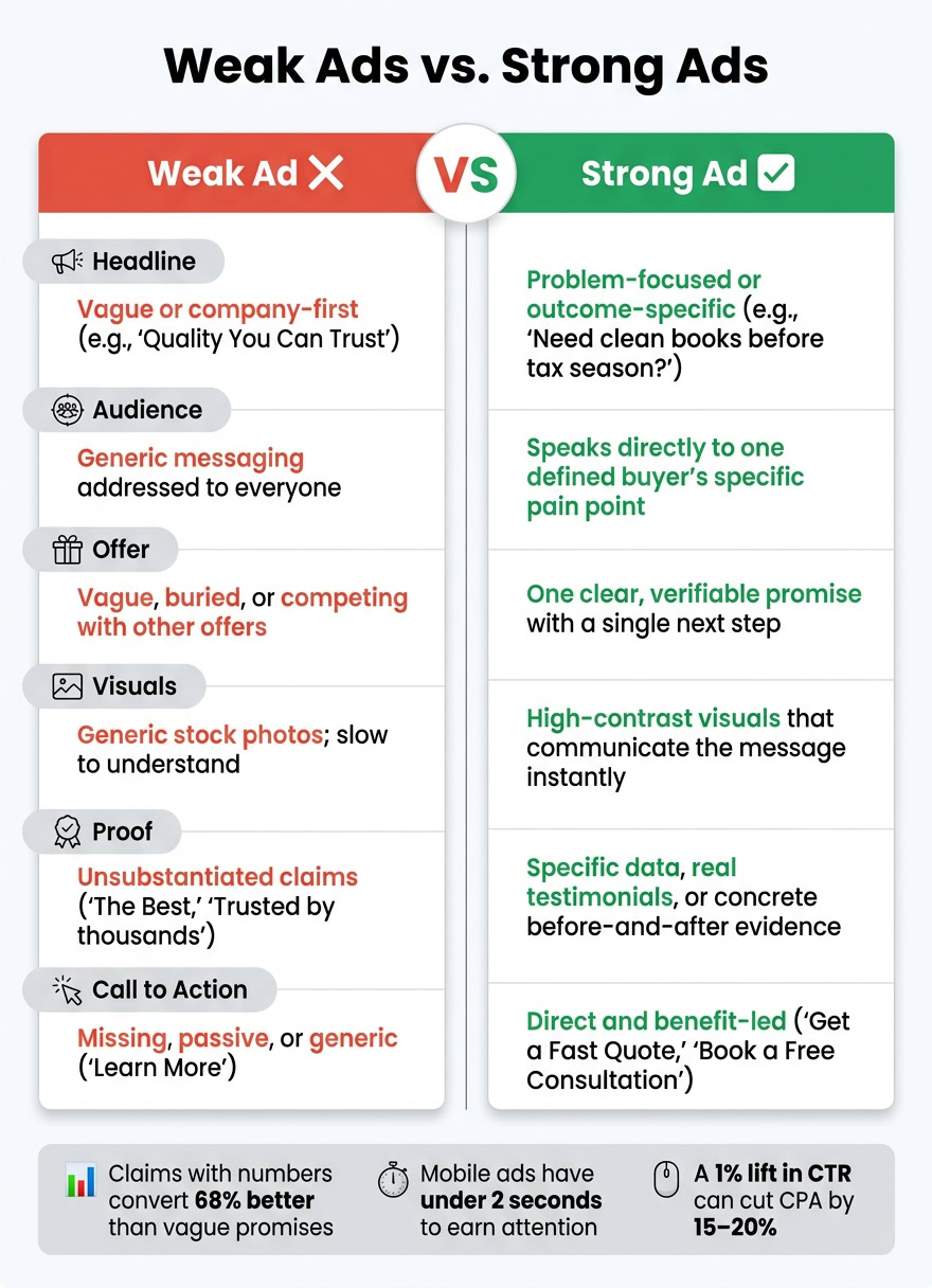
Weak Ad Traits vs. Effective Ad Traits
One of the fastest ways to spot a weak ad is to put it next to one that works.
| Element | Weak Ad | Effective Ad |
|---|---|---|
| Headline Clarity | Vague or company-first ("Quality You Can Trust") | Problem-focused or outcome-specific ("Need clean books before tax season?") |
| Audience Relevance | Addressed to everyone; uses generic messaging | Speaks directly to a defined group’s specific pain point |
| Offer Visibility | Vague, buried, or competing with other offers | One clear, verifiable promise with a single next step |
| Visual Structure | Generic stock photos; slow to understand | High-contrast visuals that communicate the message instantly |
| Proof | Unsubstantiated claims ("The Best", "Trusted by thousands") | Specific data, real testimonials, or concrete before-and-after evidence |
| Call to Action | Missing, passive, or generic ("Learn More") | Direct and benefit-led ("Get a Fast Quote", "Book a Free Consultation") |
Next, look at how these traits play out across search, display, social, and video ads.
Effective Advertisement Examples by Format
The same core ideas work across ad formats. What changes is how you apply them in search, display/social, and video. The examples below show what that looks like in practice.
Search Ads: Match User Intent with Clear Benefits
Search ads work because the person is already looking for help. Your job is to show, fast, that you offer it.
For example, a search ad for a local plumber could look like this:
Headline 1: Austin Plumber – 90-Min Arrival Headline 2: Starting at $39 Per Visit Description: Get a fast quote. No hidden fees. Schedule same-day service.
The first headline lines up with what the person searched for. The second adds the main benefit. Then the description answers a common concern with plain, specific details. That’s the key: specific numbers and direct objection handling make an offer feel easier to trust. Use numbers and fix one clear objection in the headline or description.
Copy isn’t the only thing that matters. Structure does too. With Responsive Search Ads, use the full headline and description inventory so the system can test more combinations. It also helps to add extensions like sitelinks, callouts, and price assets. They make the ad take up more space and give people more reasons to click.
Display and Social Ads: Bold Visuals, Short Copy, One Action
Display and social ads interrupt the scroll. That means the visual has to do the heavy lifting first. Good visuals show the result, the product, or the person getting the result.
A strong social ad might show a phone screen or dashboard with the outcome already visible, then pair it with one sharp promise and barely any extra text. For example: "Your business address, wherever you are." The button might say "Book Online in 60 Seconds." That mix works because it keeps things simple: one promise, one visual focus, one action. Less clutter means less mental effort, and that keeps the next step easy to spot.
Video ads have even less time to win attention, so the opening seconds matter most.
Video Ads: Hook First, Brand Early, End with Action
People decide in under 400 milliseconds whether to keep scrolling. So the first frame has to stop them.
A strong 30-second video ad usually follows a simple 3-beat structure: hook, body, CTA. For example, a business management platform could open with a text overlay like "Still printing forms and mailing them from overseas?" Then, by second five, the brand shows up next to a clean dashboard that puts the workflow in one place. The middle walks through a simple three-step setup. The last three seconds end with the same CTA spoken out loud and shown on screen: "Start your free 14-day trial." Matching the spoken and on-screen CTA cuts friction at the finish line.
For SaaS or service businesses, it also helps to show a timed workflow, like a "30-minute Monday routine." That makes the value feel concrete instead of vague.
How to Apply These Principles to Your Own Ads
A Simple Ad-Building Framework for Entrepreneurs
Keep it simple: build your ad around one audience, one problem, one benefit, one proof point, and one CTA.
For a bookkeeping ad, that could look like this: "Need clean books before tax season?" Then add one testimonial or one result. Finish with "Book a 20-minute consultation." That gives the reader a clear reason to care and a clear next step.
On visual-first platforms, the hook needs to show relevance fast. People decide in a split second whether your ad is for them.
Once you have a draft, give it a quick check before spending any budget.
A Pre-Launch Checklist to Improve Ad Response
Use this checklist to spot weak ads before they go live.
| Category | What to Check | Pass Criteria |
|---|---|---|
| Headline | Does it name a specific pain or outcome? | Yes – no vague adjectives |
| Visual | Does it stop the scroll in under 2 seconds without sound? | Yes – mobile-first, vertical format |
| Offer | Is the "what’s in it for me" obvious in 3 seconds? | Yes – one clear benefit stated |
| Trust | Is there one proof point (review, stat, or result)? | Yes – no unsupported claims |
| CTA | Is there one specific action verb? | Yes – one clear action |
| Message Match | Does the landing page headline match the ad’s promise? | Yes – verbatim match preferred |
When you test, change one variable at a time. If you swap both the headline and the image in the same test, you won’t know what changed the numbers.
Start with the hook. It usually has the biggest impact. You can also test plain-text card variants with a small budget before paying to make video.
After launch, keep an eye on early warning signs. If you see a 20–30% drop in CTR or a 15% week-over-week rise in CPA, the ad likely needs a new angle, a new visual, or a new hook.
Conclusion: The Core Traits of Ads That Perform
High-performing ads tend to share the same traits: a clear message, the right audience, strong proof, and a direct CTA. When those four pieces are in place, the ad is much more likely to do its job, no matter the format, budget, or platform.
FAQs
How do I know if my ad message is too vague?
Your ad message is probably too vague if it leans on generic adjectives, slogans, or fluffy marketing language instead of the words customers use to describe their problems.
A few signs tend to show up fast. You may be trying to speak to everyone at once. Your value proposition may not be clear. You may be piling on too many claims in one message. Or your headline and call to action may sound polished, but still leave people thinking: Why does this matter to me? and What happens if I click?
That’s usually where ads start to drift. They sound nice. They just don’t say enough.
What kind of proof should I use in an ad?
Use specific proof that builds trust and cuts doubt. One strong proof point usually works better than a pile of weaker ones because people are more likely to remember it.
Good proof can be a customer testimonial, a star rating, a clear stat, a well-known logo, or a before-and-after result. The key is precision. Saying you cut cycle times from 4 days to 4 hours lands much harder than making a broad promise.
How can I improve an ad without raising my budget?
Improve performance by getting more out of the ads you already run instead of pouring in more money. Start with the hook. That’s usually the part that moves results the most, so test different hooks first and leave the rest of the ad unchanged. That way, you can see what actually clicks with people.
Take a modular approach to the ad itself. Work on the hook, body copy, proof, and call to action one at a time instead of changing everything at once. It’s a bit like tuning an engine: if you adjust five parts at the same time, you won’t know which one fixed the problem.
Keep each ad centered on one clear idea. Use specific, benefit-led language so people can tell, fast, what’s in it for them. And make sure the CTA fits the user’s level of intent. Someone who’s just getting to know you may respond to “Learn more,” while a warmer prospect may be ready for “Book a demo” or “Start now.”